01 — The Café
The Drove
Brand Identity · Packaging · Collateral
A concept brief for an independent Cotswolds café, positioned around the ancient drove roads that cross the area. Trackways worn into the landscape over centuries by farmers moving cattle to market. The challenge: build a brand that feels like it has always been here.

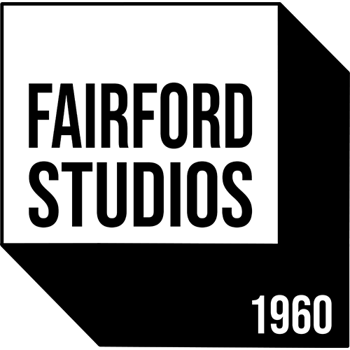
Final sleeve on location, Cotswold stone windowsill
The crow mark, a drover on his post watching the long road. In context on a Cotswold dry stone wall.
The thinking
Drove roads are the oldest routes in the Cotswolds, narrow trackways worn into the landscape over centuries by farmers moving cattle to market. Every town has one. Most people walk them without knowing the name. That specificity was the concept.
Stranger & Stranger's design philosophy is built around brands that have earned their character, identities that feel discovered rather than designed. The crow on the gatepost became that character: patient, rooted, watching the road.
The execution
The woodcut illustration style gives the mark an engraved quality, as if it belongs on a Victorian trade token or a hand-press broadsheet. Deep sage green against kraft paper reads premium without pretension. The hierarchy runs three tiers: THE DROVE at full weight, Coffee for the long road at a whisper, EST. 2023 and SMALL BATCH as a reward for a closer look.
Every touchpoint, sleeve, business card, loyalty card, bag seal, carries the same crow mark at different scales, proving the brand system rather than just the logo.

The full brand system, sleeve, business card, loyalty card, bag seal
Brand Strategy
Positioning, naming rationale, tone of voice
Visual Identity
Woodcut mark, colour palette, typography system
Collateral
Cup sleeve, business card, loyalty card, bag seal
Sector
Independent Hospitality, Cotswolds
02 — The Craft Producer
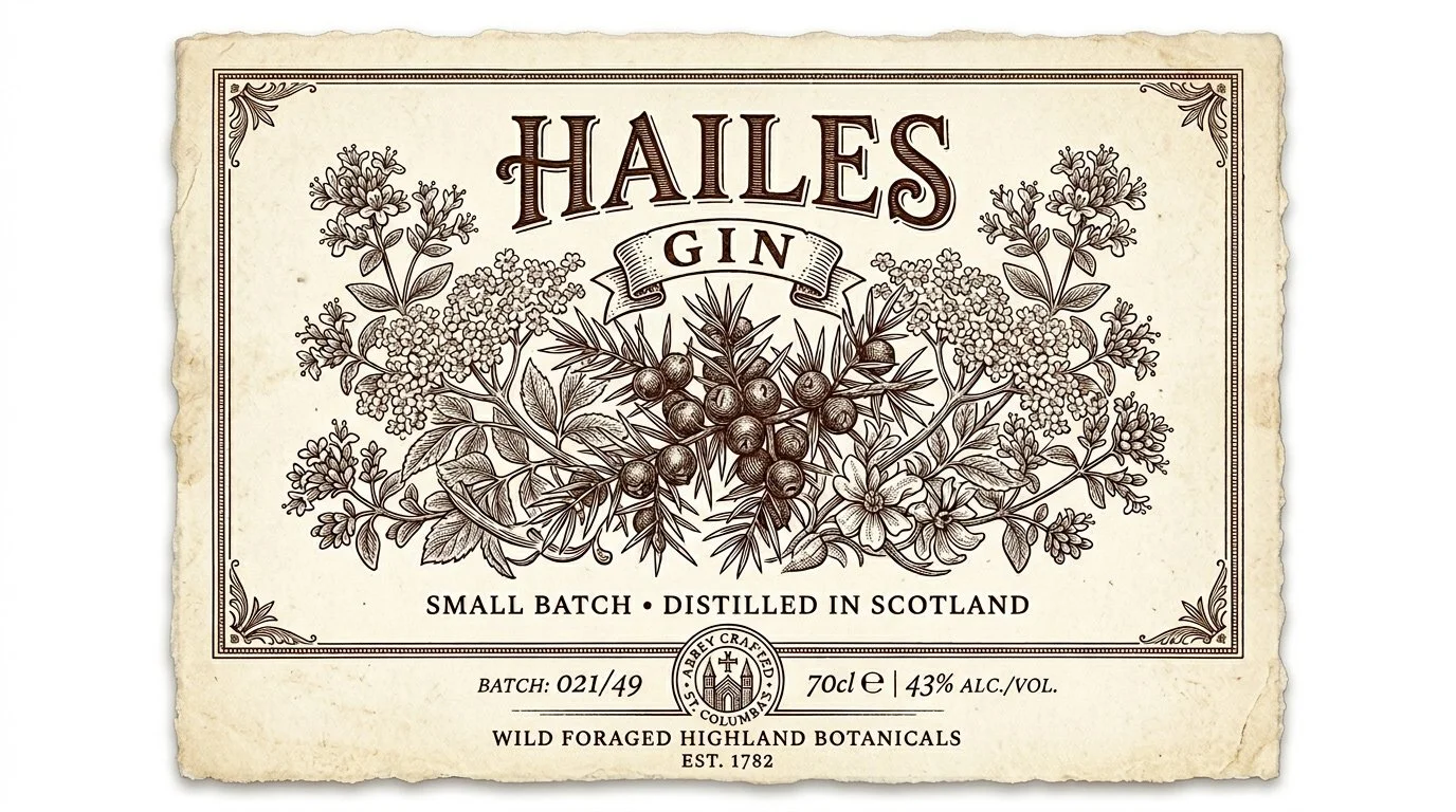
Hailes Gin
Brand Identity · Label Design · Packaging
A concept brief built around Hailes Abbey, a 13th-century Cistercian ruin in the north Cotswolds, and the botanicals that grow in its grounds. The challenge: a gin label that carries the weight of its place without pretending to be something it is not.
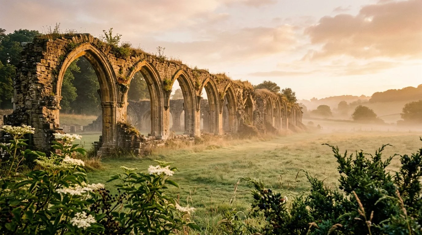
Hailes Abbey, Winchcombe, the source
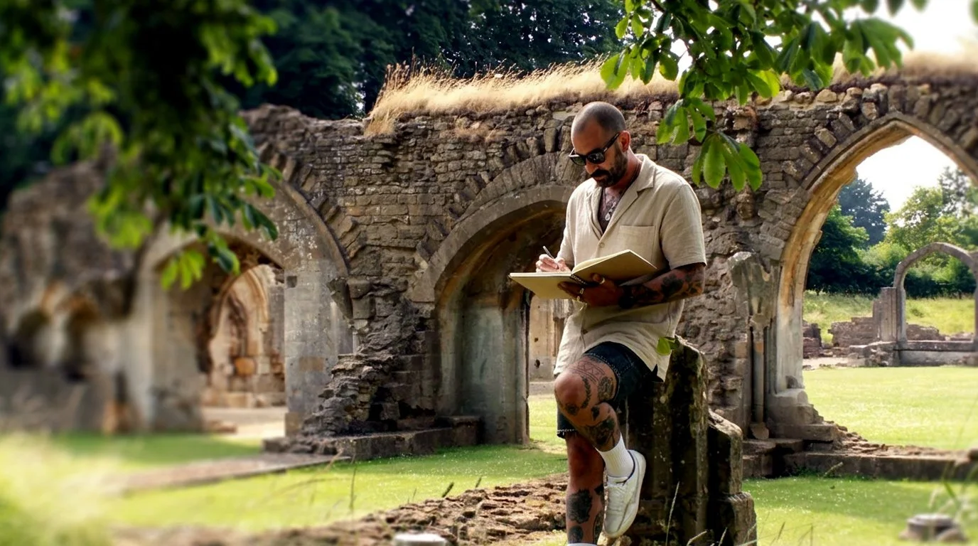
Discovery on location, Hailes Abbey. Reference botanicals: juniper, elderflower, wild marjoram.
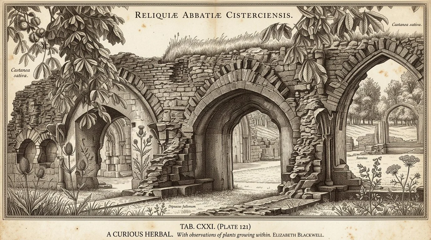
Hailes Abbey rendered in engraving style, the visual language that shaped the label aesthetic
Where it started
Hailes Abbey was founded in 1246. For three hundred years it was one of the great pilgrimage sites in England, drawing travellers from across the country to see a relic of the Holy Blood. The place has gravity. The concept was to build a gin label that earns that gravity, not by pretending to be ancient, but by being honest about what it means to make something here, now, with plants that grew in that ground.
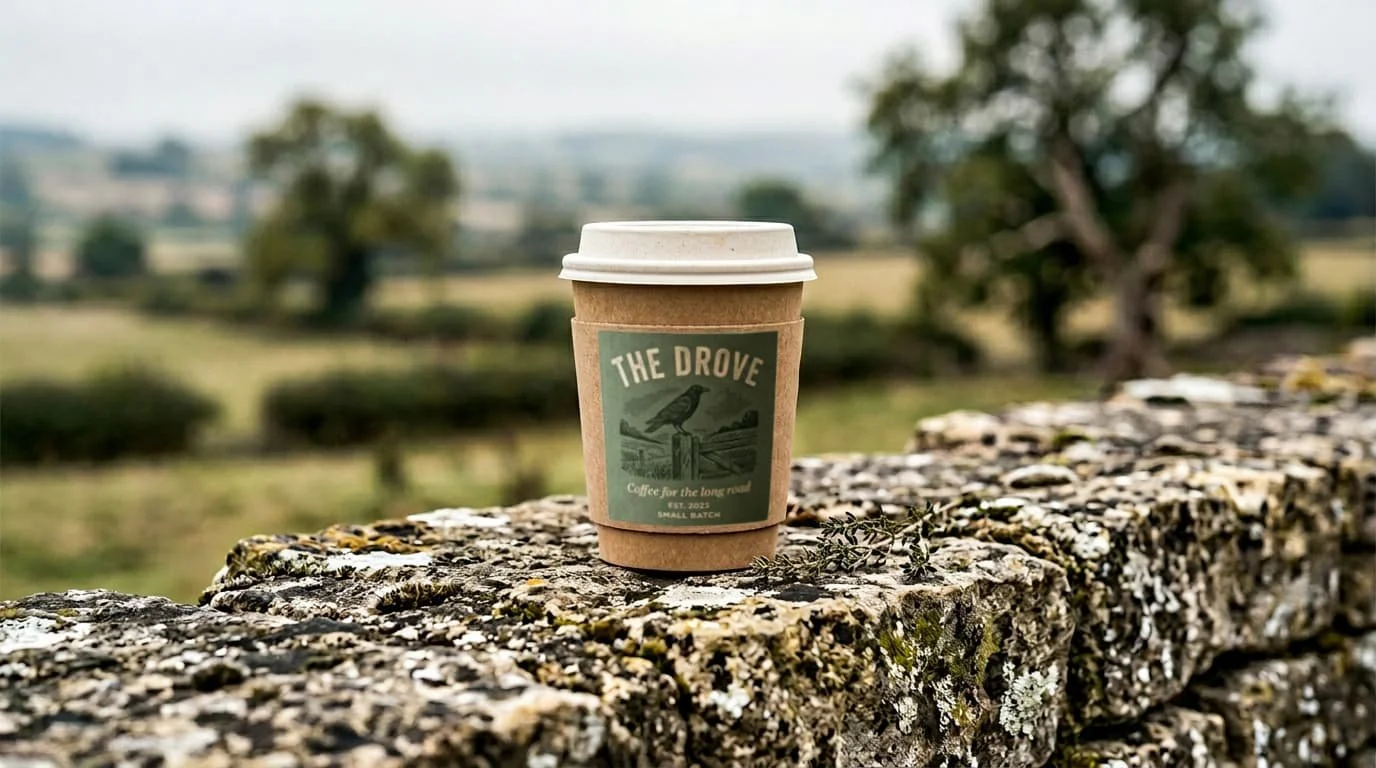
The research started at the abbey: sketching the arches, studying the proportions of the nave, finding the visual language before touching a computer.
The process
The typography study ran through multiple iterations before the right weight was found. HAILES is a short name, five letters all capitals, and it behaves differently at large scale than at label scale. The wrong weight reads as decoration. The right weight reads as architecture.
The botanical illustration was built as a dense, interlocking garland, juniper at the centre, elderflower flanking, wild herbs at the edges. The density is intentional: it should reward time, the way the monks' illuminated manuscripts did. One pass tells you it is premium. A second pass tells you it is specific.

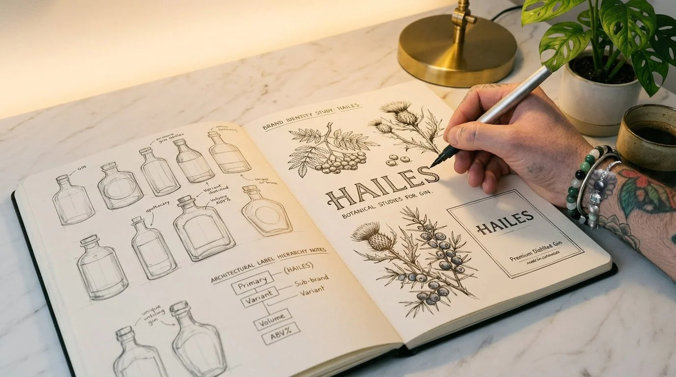
Discovery and development, botanical reference, on-location sketching, identity studies
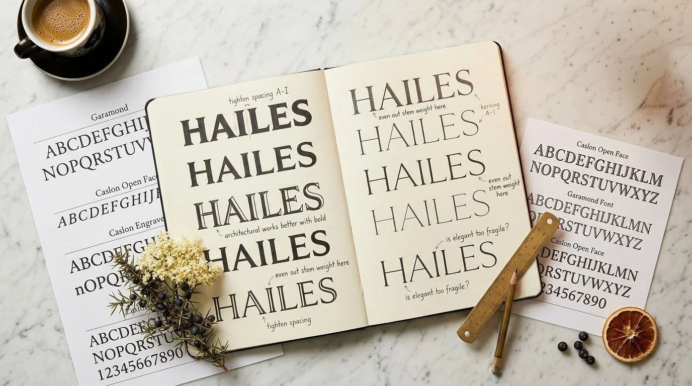
Typographic iterations before the final weight was resolved, Caslon Open Face, Garamond, bespoke adjustments
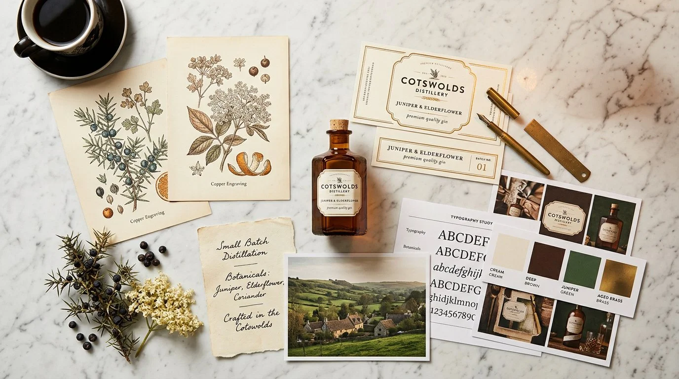
Brand moodboard, colour palette, botanical reference, label architecture studies
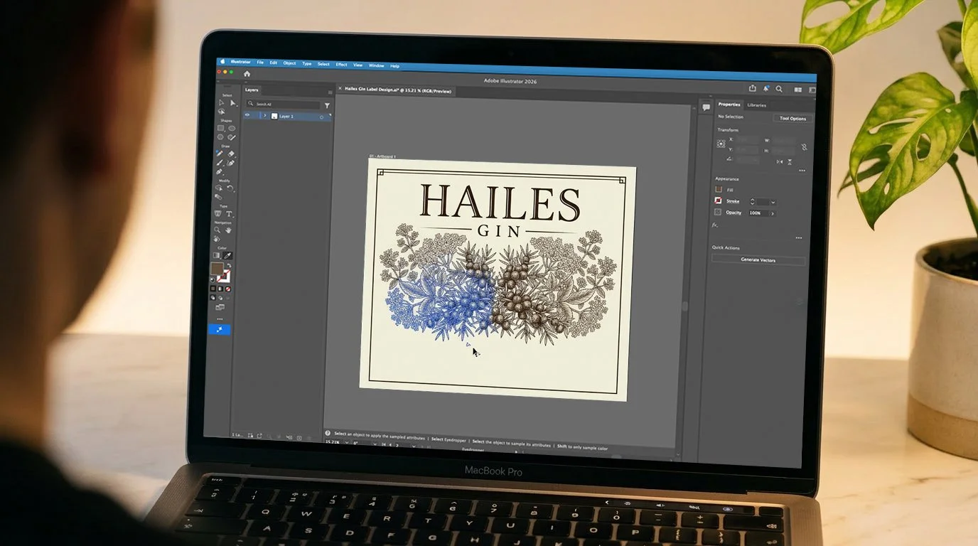
In production, Adobe Illustrator, final label build
"The density is intentional. It should reward time, the way the monks' illuminated manuscripts did."
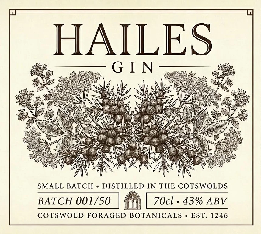
Two label directions: a clean contemporary ground and an aged parchment variant, same mark, different register
Brand Strategy
Narrative positioning, place-led identity
Visual Identity
Botanical illustration, typographic system, two label variants
Process
On-location research, multiple type iterations, hand illustration reference
Sector
Premium Spirits, Cotswolds
03 — The Independent Brand
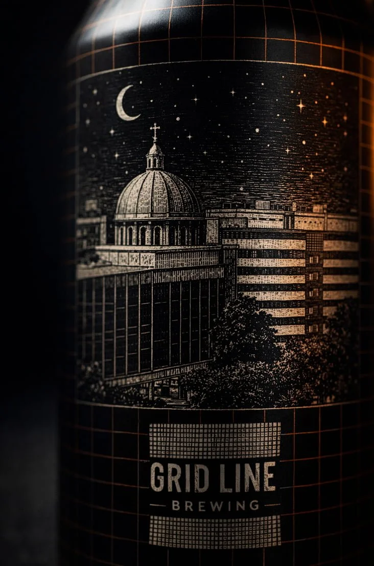
Gridline Brewing
Brand Identity · Can Design · Range Architecture
A concept brief for a craft brewery built around the grid, the planned geometry of roads, routes, and urban connections. Each can in the range carries its own landscape, unified by a shared visual system. The challenge: design for a range, not just a single product.

The full Gridline range, H3 Horizon IPA, Redway Pale Ale, Nightshift Milk Stout, V6 Velocity Session Lager
The Gridline mark and illustration detail, each can carries its own landscape within the same visual system
The thinking
Design for a range, not a label
The most common mistake in craft beer branding is designing a single label and then trying to extend it. The result is a range that looks assembled, not designed. Gridline started from the opposite position: what is the system that makes four completely different cans feel like they belong together?
The answer was the grid itself, the underlying structure that maps roads, urban plans, and connections. Each can carries a different landscape illustration, but the grid overlay, the typography system, and the colour logic are fixed. The range has coherence because the architecture is shared, not because the illustrations match.
The execution
Four landscapes, one system
H3 Horizon IPA. A road disappearing into a sunrise horizon. Warm amber and gold. The optimistic one.
Redway Pale Ale. A winding path through bare winter trees. Fresh green. Clean and light.
Nightshift Milk Stout. A civic building under a crescent moon. Near-black. Rich and specific.
V6 Velocity Session Lager. A dual carriageway heading to the horizon. Velocity blue. Crisp and direct.
Brand Strategy
Range architecture, naming system, visual logic
Visual Identity
Brand mark, grid system, four landscape illustrations
Deliverables
Full can artwork for four SKUs, brand guidelines
Sector
Craft Brewing, Independent
Your business has a better story than it's telling.
If you're an independent business, a craft producer, or a brand that's genuinely good at what it does but not landing the way it should, come and talk. No pitch. No deck. Just a conversation.