
Print Isn’t Dead:
The Revival of Tactile Marketing in a Digital World
(Why the Smartest Brands Are Going Back to Paper)
I’ll admit something that might sound strange coming from someone who builds brands in the digital space. My favourite thing in any design studio isn’t a screen. It’s a drawer.
Specifically, it’s the drawer full of paper samples. Uncoated stocks with a tooth that catches your fingertip. Soft-touch laminate that feels like pressing your thumb into a peach. Thick, rigid board with an embossed logo that you can feel with your eyes closed. I’ve spent more time running my hands over paper swatches than I’d care to admit.
I came up through design. Before I picked up a camera, before Aperture North existed, I was obsessed with print. The weight of a well-made business card. The crack of a freshly trimmed edge. The way a spot UV varnish catches the light and makes a logo feel like it’s rising off the surface.
And here’s what nobody in the digital marketing world wants to say out loud: we’ve been so busy chasing pixels that we forgot what made branding powerful in the first place: the physical world.
So I’m going back. Not backwards — back. I’m building two personal print projects from scratch: one for a pizza brand, one for a local craft beer. Not client briefs. Not safe mockups. Real printed materials that I can hold, photograph, and put in front of people.
This article is about why.
In a world where every brand lives on a screen, the ones you can touch are the ones you remember.
The Numbers That Changed My Mind
I know what you’re thinking. “Print? In 2026? Hasn’t that ship sailed?” That’s exactly what I thought. Then I started looking at the data.
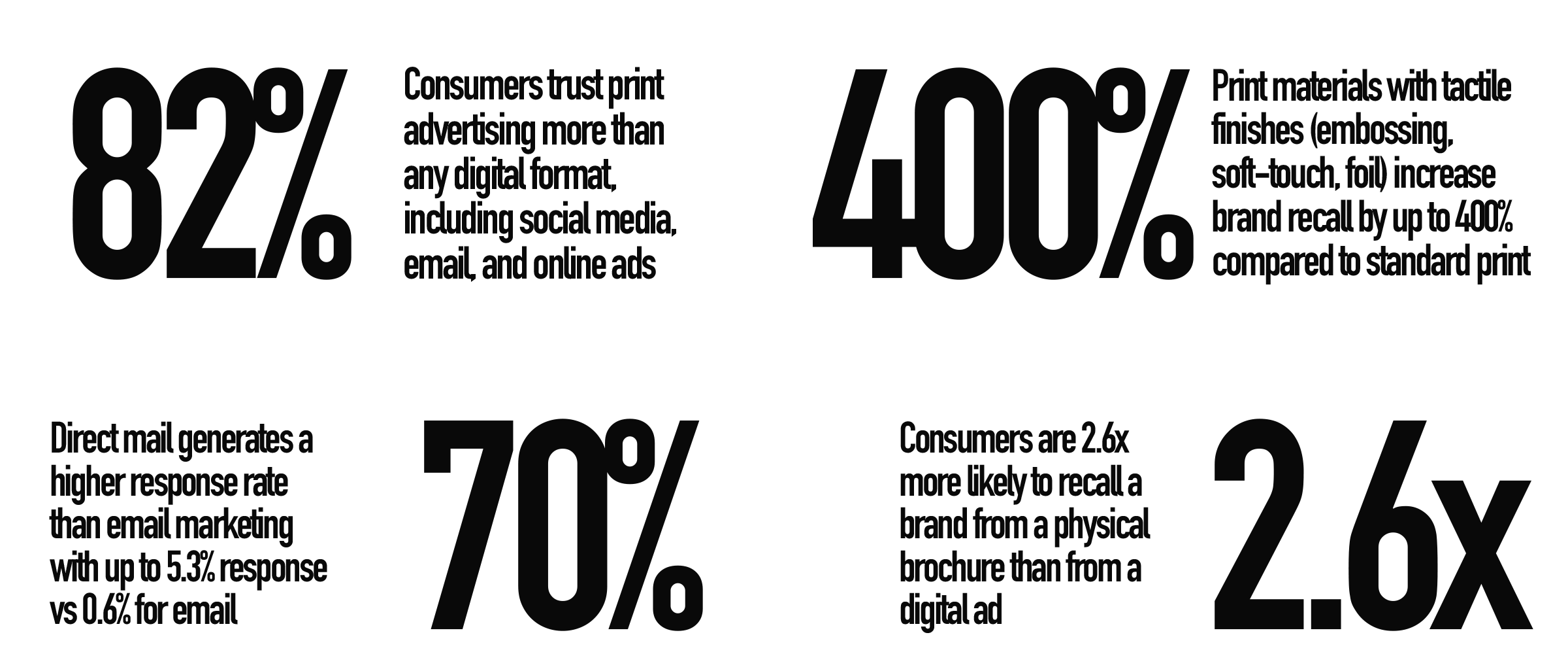
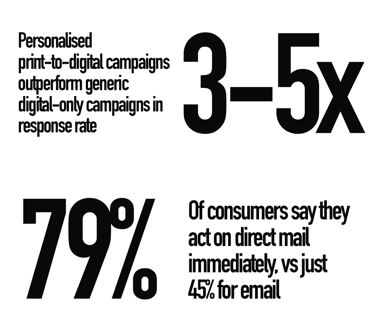
Read those numbers again. Not a single one of them is close. Physical marketing isn’t slightly better than digital in certain contexts. It’s dramatically better at the things that matter most: trust, recall, and response.
And here’s the kicker: neuroscience backs it up. Research from Temple University and the Royal Mail found that physical materials engage more areas of the brain than digital content. They require more emotional processing. They generate stronger memory encoding. And they produce a stronger “desire response” the internal signal that says “I want this.”
Physical materials activate the brain’s spatial memory network. Your customer doesn’t just see your brand. They locate it in their physical world. That’s a kind of recall no Instagram ad can match.
Why 2026 Is the Year Print Comes Back
Three things are converging right now that make this the perfect moment for tactile marketing. And if you’re a boutique brand, you’re in the best position to capitalise on all three.
1. Digital Fatigue Is Real
The average person sees between 6,000 and 10,000 digital ads per day. Per day. That number has roughly doubled since 2020. The human brain hasn’t evolved to process that volume of visual noise, so it does the only rational thing: it tunes out.
Banner blindness. Ad fatigue. Scroll velocity increasing year on year. These aren’t trends — they’re defence mechanisms. Your audience’s brain is literally protecting them from your digital marketing.
Print cuts through that. A beautifully designed menu on a thick, uncoated stock. A business card with a debossed logo. A branded coaster that sits on a bar all evening. These things occupy physical space in someone’s world, and that gives them a kind of persistence that a digital ad simply can’t achieve.
2. Gen Z Is Buying Vinyl (and Everything Else Physical)
Here’s the generation that was supposed to kill print. Instead, vinyl sales hit their highest point in 40 years in 2024. Independent bookshops are thriving. Polaroid cameras are a fashion accessory. Film photography is back.
This isn’t nostalgia. Gen Z never lived in the analogue era — they can’t be nostalgic for it. This is a generation craving physical, tangible, real-world experiences because they grew up in a world that was almost entirely digital. They don’t want retro. They want real.
For brands, this is an enormous signal. The generation with the most purchasing power in a decade isn’t moving further into digital. They’re reaching for things they can hold.
3. Print Technology Got Really, Really Good
This is the bit that gets me excited as a designer. The finishing techniques available now are extraordinary, even for small-run boutique work:
Spot UV varnish: Selective high-gloss coating that makes a logo or pattern pop off a matte surface. It catches the light differently from every angle.
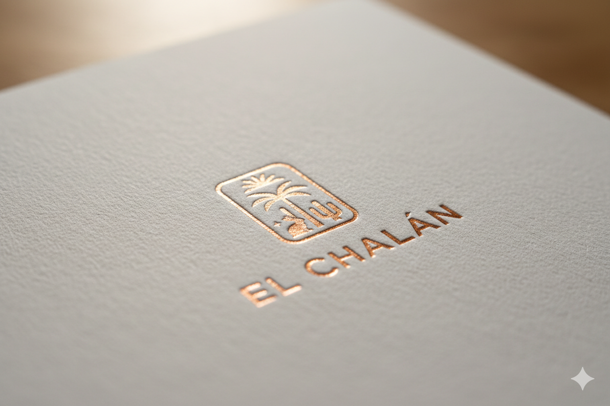
Foil stamping: Metallic or holographic foil pressed into paper stock. Not just gold and silver anymore — rose gold, copper, iridescent, matte black foil on black paper.
Embossing and debossing: Raised or recessed designs you can feel with your fingertips. Close your eyes and you’d still know which brand it belongs to.
Soft-touch laminate: A coating that makes paper feel like suede. It’s the reason you keep picking up certain business cards long after you’ve saved the contact.
Letterpress: Physically pressing type into thick cotton stock. The impression you can feel. It’s slow, it’s expensive, and it’s absolutely beautiful.
Die-cutting: Custom-shaped cards, menus, and packaging. A round business card. A menu shaped like a pizza slice. If you can draw it, someone can cut it.
These used to be prohibitively expensive for anything other than luxury brands. Now, with digital print technology and short-run specialists, a small brand can order 500 spot UV business cards for less than the cost of a week’s Facebook ads.
The Boutique Brands That Understand This
The smartest brands in the world never stopped investing in print. They just got more intentional about it.
Craft Beer: Where Print Is the Product
Walk into any bottle shop and tell me the label doesn’t matter. 72% of consumers say packaging design directly influences their purchasing decisions. In craft beer, the label is the marketing. It’s the first and often only touchpoint before someone decides to spend £5 on an untested beer.
Breweries like Omnipollo in Sweden turned this into an art form. Their labels are full-bleed illustrations on textured stock — collectible, shareable, and instantly recognisable from across a shop. Cloudwater in Manchester uses a clean, minimal design system across every can that makes the brand feel considered and consistent. Beavertown built an entire visual universe around their skull logo — bones, aliens, and psychedelic colour — to the point where the packaging is as much a reason to buy as the beer.
These breweries understand something that a lot of digital-first brands miss: the label isn’t an afterthought. It’s the entire brand experience compressed into a few square inches of printed surface. And when it’s done well, people photograph it, share it, and collect it.
Pizza: Print Meets Personality
The pizza industry is having a quiet design renaissance, and it’s being led by independents. Yard Sale Pizza in London uses retro typography and hand-drawn illustration across their menus, boxes, and merch that makes the brand feel like a neighbourhood institution. Voodoo Ray’s pairs neon punk aesthetics with oversized pizza boxes that double as brand billboards on every table.
Internationally, Pizzana in LA developed a minimal, earthy design system across menus, napkins, and packaging that feels warm, Italian, and intentional. And &pizza turned their entire restaurant chain into a print design playground — every surface, from the walls to the boxes to the receipt, is covered in bold graphic typography.
What all these brands share is a commitment to the idea that print isn’t a cost, it’s a canvas. The pizza box isn’t just a container. It’s a brand moment that sits on someone’s kitchen table, gets photographed for Instagram, and lives in their memory long after the last slice.
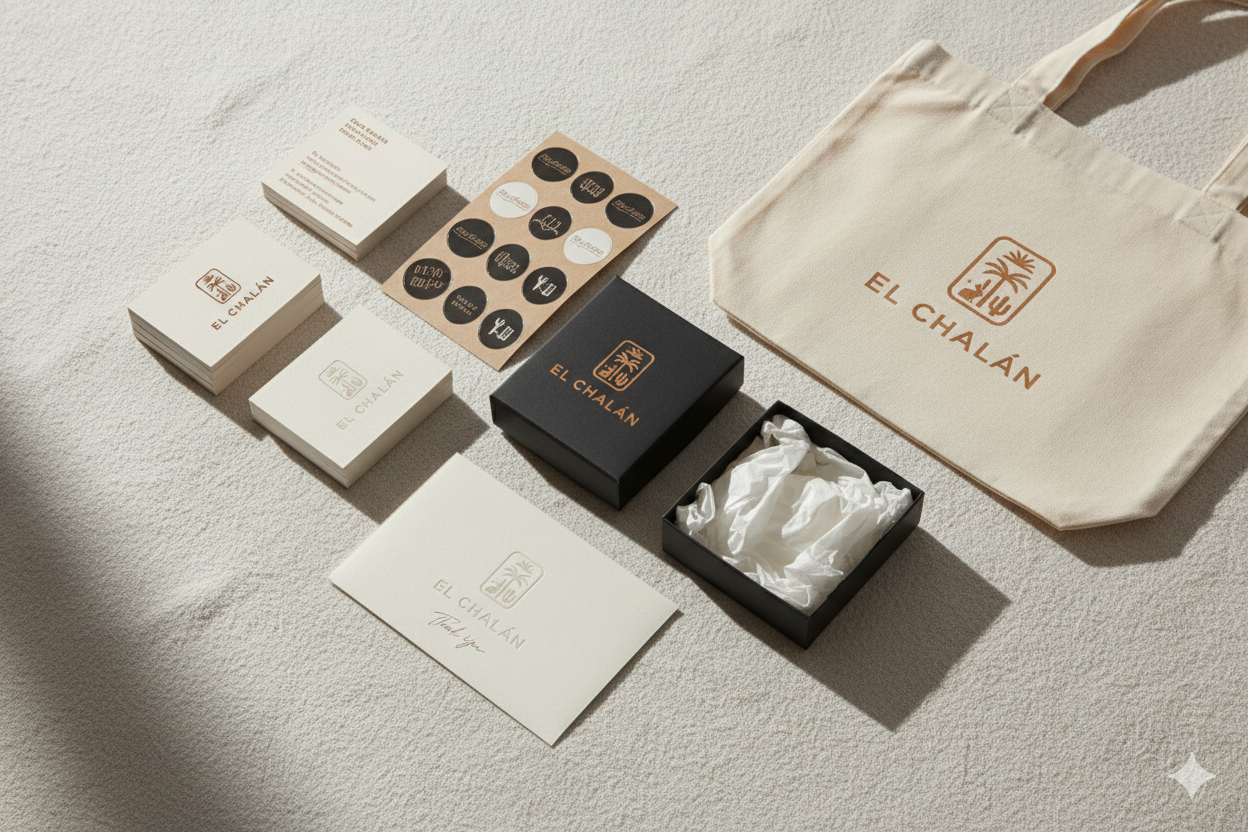
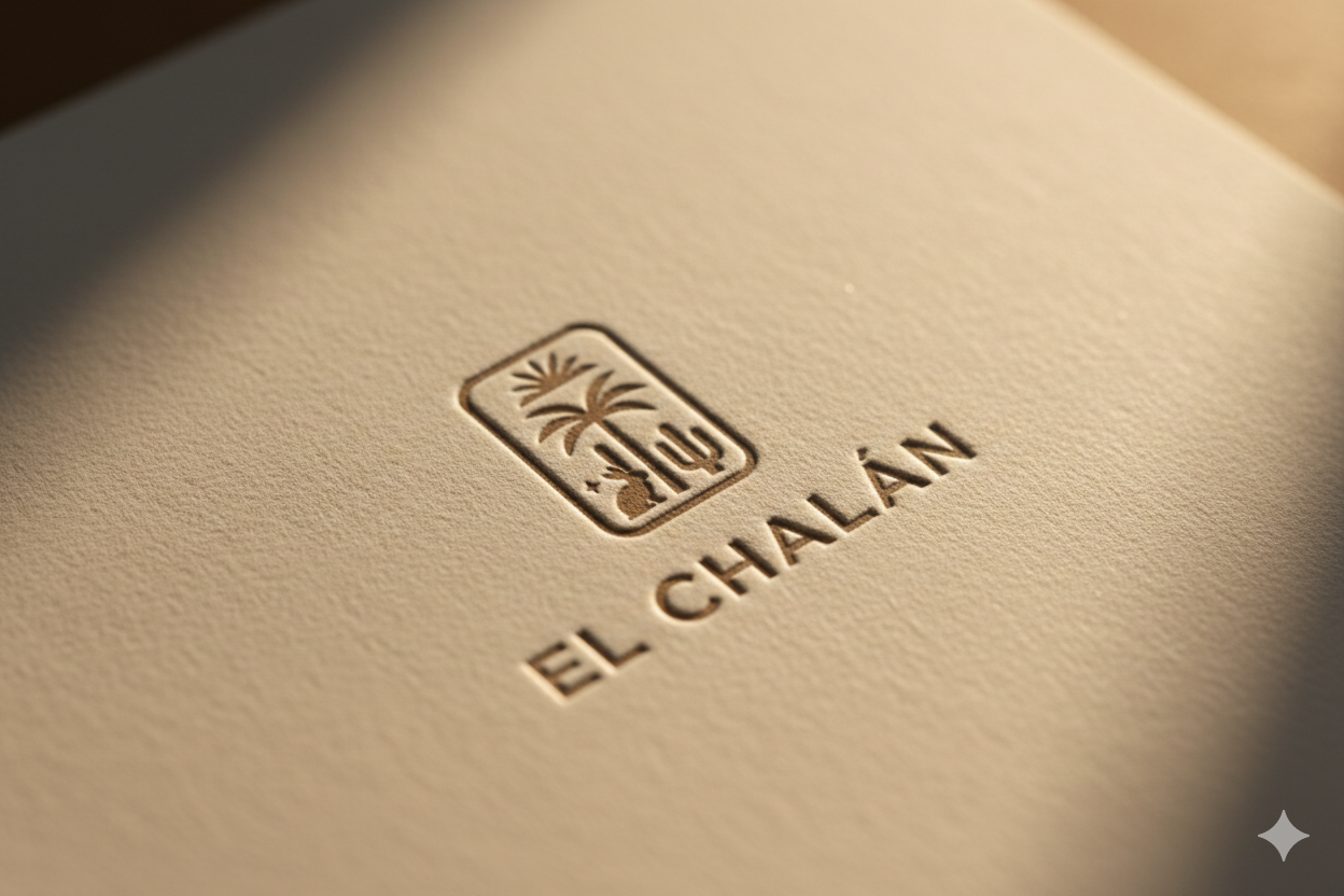
Luxury & Boutique: The Gold Standard
At the luxury end, print is non-negotiable. Aesop wraps every product in textured, uncoated paper with a hand-applied label. Le Labo prints your name, the date, and the store location on every bottle label — turning a purchase into a personalised artefact. The White Company uses heavyweight, soft-touch catalogues that feel like coffee-table books.
These brands don’t use print because it’s trendy. They use it because they understand that luxury is experienced through touch as much as sight. When a customer holds an Aesop bag, the texture of the paper communicates quality before they’ve even opened the product.
Why I’m Building Two Print Projects from Scratch
Here’s where I put my money where my mouth is.
I’ve spent years working in the digital space — websites, video, social media, brand identity on screen. And I love that work. But my design background keeps pulling me back to the physical. I miss the craft of print. The specificity of it. The fact that once it’s printed, it’s permanent no undo button, no A/B test, no algorithm. Just a piece of design that has to work on its own merits.
So I’m creating two passion projects to prove (to myself as much as anyone) that everything I’ve been writing about in this article actually works when you put it into practice.
Project 1: A Pizza Brand
Not a client brief. Not a logo-and-colour-palette-in-a-PDF kind of project. A full, printed brand identity for a fictional pizza brand — from the menu to the box to the napkin to the loyalty card. Every touchpoint, designed and printed on real stock.
I want to explore how far you can push personality through print. Die-cut menus. Pizza boxes with illustration that people want to keep. A loyalty card on thick, tactile stock with a debossed logo. Branded stickers. A zine-style lookbook showing the brand in context.
The goal isn’t just to make it look good on screen (though it will). The goal is to make it feel irresistible in your hands. That’s the test.
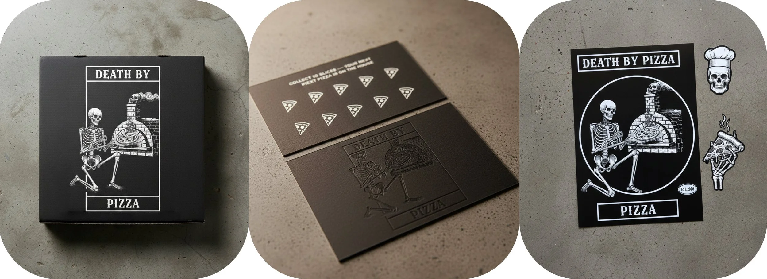
Death by Pizza brand materials. A debossed loyalty card on heavyweight matte black stock and a collection of die-cut vinyl stickers featuring the skeleton and stone oven illustration.
Project 2: A Local Craft Beer
The craft beer industry is one of the best examples of print-as-brand in the world right now. Every can, every label, every tap badge is a design decision that directly influences whether someone picks it up.
I want to design a full label system for a local craft beer a core range and a seasonal special. The kind of thing where someone walks into a bottle shop, picks the can off the shelf purely because of how it looks, and then goes back for more because the beer is good and the brand stuck in their head.
I’m planning to explore textured label stock, foil details on a limited-edition run, and a visual identity that works at every scale, from a small tap badge to a large-format poster in the brewery taproom.
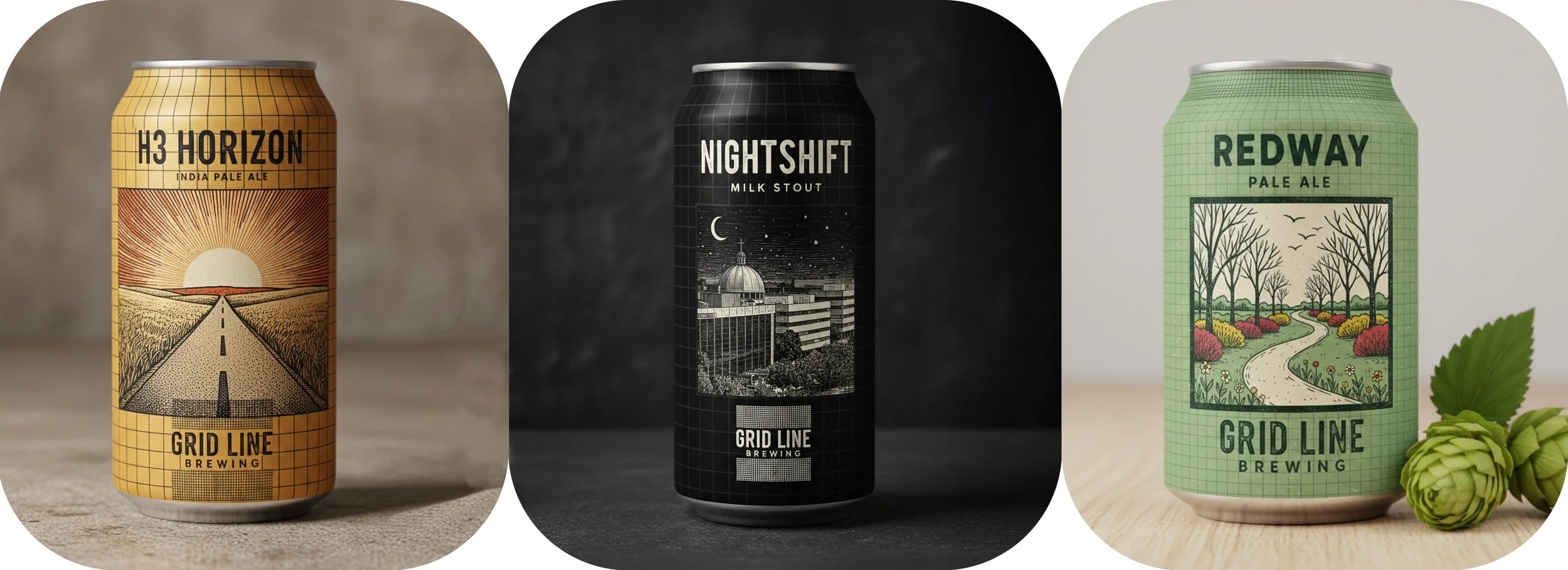
Grid Line Brewing core range — H3 Horizon IPA, Nightshift Milk Stout, and Redway Pale Ale. Hand-drawn linocut illustrations on a consistent grid layout system, each can with its own colour palette.
Print Isn’t the Opposite of Digital. It’s the Partner.
This is the bit that most people get wrong. They think choosing print means abandoning digital. It doesn’t. The smartest brands in 2026 are using print as the entry point into a digital experience and vice versa.
The Bridge Tools
QR codes (done properly): Not a clunky black-and-white square slapped in a corner. A branded QR code integrated into the design that takes someone from a physical menu to an online ordering system, or from a business card to a portfolio video.
NFC chips: Embedded in a business card or a product tag. Tap your phone and you’re watching a brand video, visiting a website, or saving contact details — no typing, no searching.
AR layers: Point your phone at a label and a 3D animation appears. Craft breweries are already doing this, it turns a static can into an interactive brand moment.
Personalised URLs: A unique web address printed on a direct mail piece that takes the recipient to a personalised landing page. Response rates for these are 3-5x higher than generic URLs.
The point isn’t to choose physical or digital. It’s to create a journey that flows between both where every printed piece drives a digital action, and every digital touchpoint makes you want to hold the brand in your hands.
The best print in 2026 doesn’t replace the screen. It makes you pick up your phone because you’re curious. That’s the bridge.
How to Start (Without Blowing Your Budget)
If you’re a boutique brand reading this and thinking “I can’t afford a big print run,” I’ve got good news. You don’t need one.
Start with Your Business Card
This is the single most underestimated brand asset in existence. Most people treat it as an afterthought — name, number, email, done. But a well-designed business card on the right stock with the right finish is the most powerful brand ambassador you own.
Choose a stock with personality: 350gsm or heavier. Uncoated for a natural, artisan feel. Soft-touch laminate for a modern, tactile premium.
Add one finishing detail: Spot UV on the logo. A foil-stamped icon. An embossed texture. Just one — restraint is the mark of good design.
Make it memorable: A non-standard size, a rounded corner, a unique shape. Something that makes the recipient pause instead of tossing it in a drawer.
A run of 500 premium business cards with spot UV or foil can cost less than £150. That’s less than a week’s Instagram ad spend, and they’ll sit in wallets and on desks for months.
Then: Pick One More Printed Touchpoint
Don’t try to print everything at once. Choose the touchpoint that has the highest impact for your business:
Food & drink: The menu. It’s the single most-handled item in any restaurant. Get the stock right and the design right, and people will photograph it.
Retail: The packaging. A branded box, a textured bag, a hand-stamped tag. The unboxing experience is content waiting to happen.
Service businesses: The proposal or welcome pack. A printed, bound document on quality stock says “I take this seriously” louder than any PDF ever will.
Everyone: Thank-you cards. A handwritten note on a branded card after a purchase or project creates loyalty that no email automation can replicate.
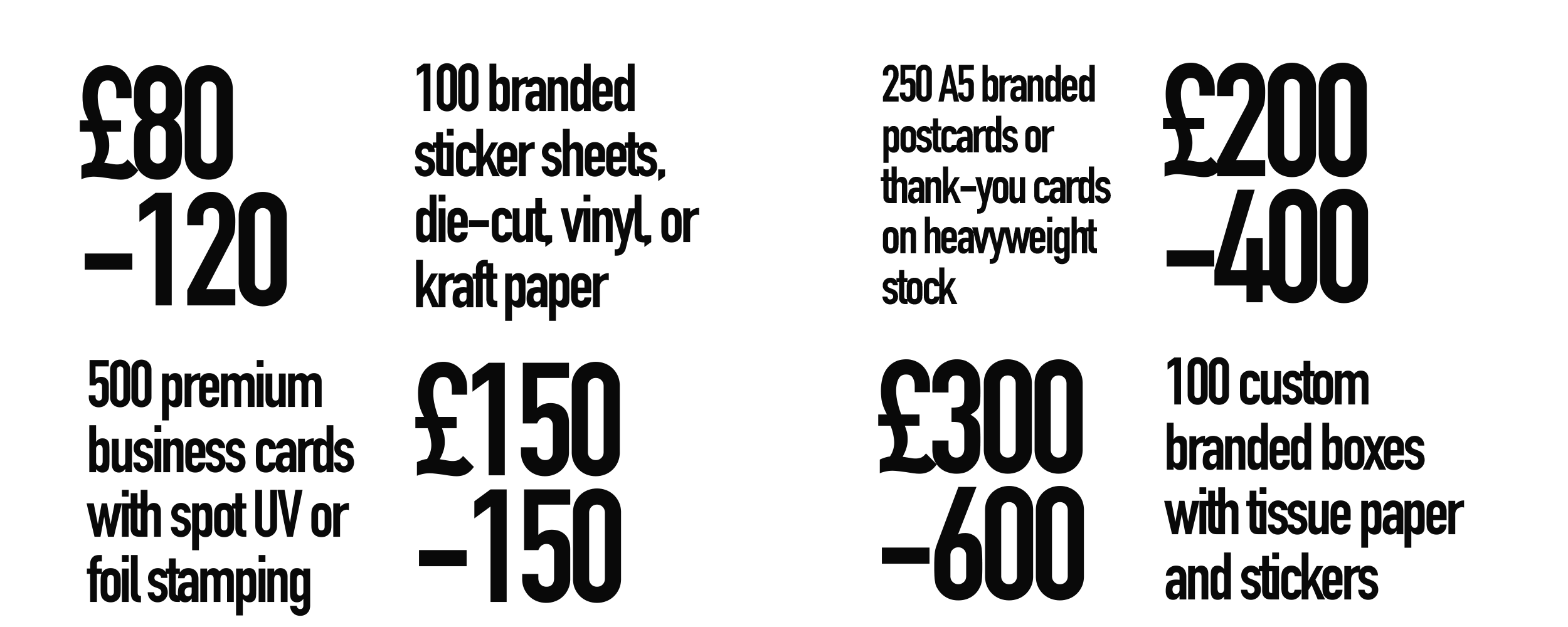
Budget Reality Check
Here’s what boutique-level print actually costs:
The Real Question
Here’s what I keep coming back to. Every brand I’ve mentioned in this article - the craft breweries, the pizza joints, the luxury labels, they all share one thing. They didn’t treat print as an obligation. They treated it as an opportunity to make someone feel something.
The question isn’t “Should we do print?” The question is: when someone holds your brand in their hands, what do they feel?
Because if the answer is “nothing”, if your business card is flimsy, your packaging is generic, your printed materials are an afterthought, then you’re leaving an enormous amount of trust and recall on the table.
And if you’re a boutique brand competing against bigger companies with bigger budgets, this is your edge. They can outspend you digitally. They can’t out-design you physically. Not if you care more than they do.
I’m building those two projects - the pizza brand and the craft beer, because I believe that. I want to prove that a single, thoughtfully designed piece of print can do more for a brand than a month of social media posts. And when they’re done, I’ll show you exactly how.
Print done properly.
The Gridline Brewing story.
If you're an independent brand reconsidering how print fits into your strategy — see how we approached it for Gridline Brewing, from identity through to packaging.