
Gin
Where the name comes from
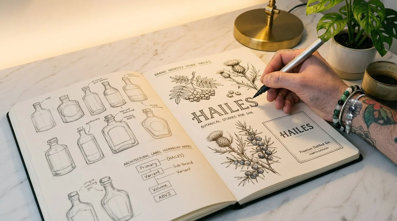
Hailes Abbey sits near Winchcombe in the Gloucestershire Cotswolds — a Cistercian monastery founded in 1246 by Richard, Earl of Cornwall, dissolved by Henry VIII in 1539. For nearly three centuries, the monks cultivated botanical gardens: angelica root, elderflower, wild marjoram, juniper. Not for flavour. For medicine. For ritual. For survival.
The knowledge those monks accumulated didn't vanish when the abbey was dissolved. It went into the hedgerows, the kitchen gardens, and the apothecary shelves of the Cotswolds farms that surrounded it. Hailes gin is the claim that it's still there — in that landscape, waiting to be distilled.
"A bottle of gin is 80% design on a shelf. The producers who invested in proper branding sell out. The ones who didn't are invisible."
The visual lineage
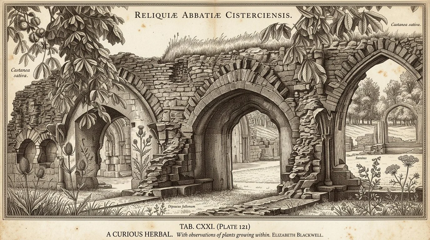
The visual language of Hailes draws directly from the copper engraving tradition of 18th century botanical illustration — specifically Elizabeth Blackwell's A Curious Herbal (1737–1739), a publication of 500 copper engravings of medicinal plants that includes every core gin botanical. The spirit of that work — precise, purposeful, made under pressure — felt right for a brand built around what survives.
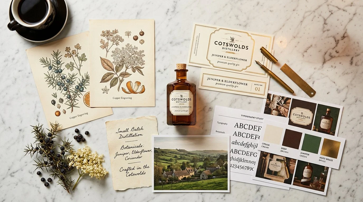
 Research — botanical herbal references, gin history, the visual lineage of the label
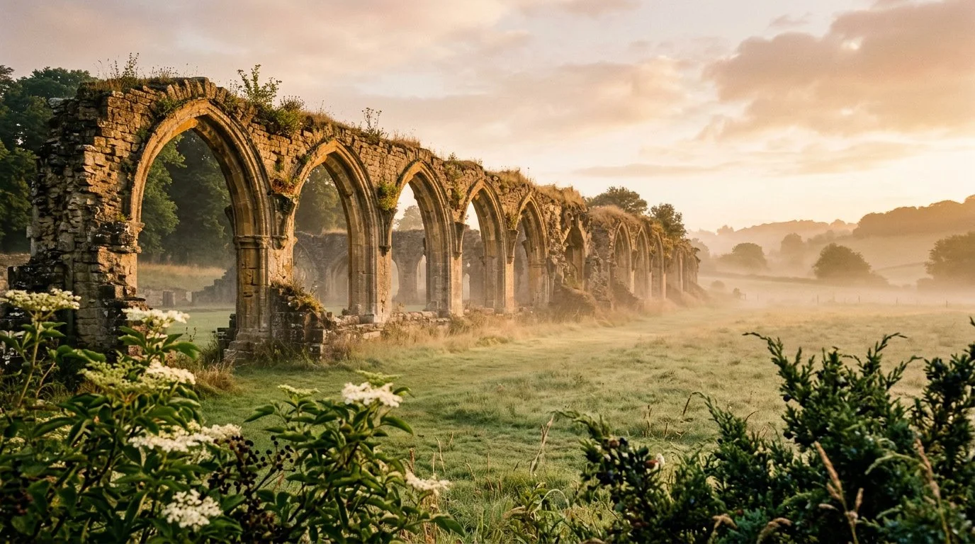
 Initial label and bottle sketches — the analogue process before the screen
 The three Hailes botanicals — juniper, elderflower, wild marjoram on Cotswolds limestone
Building the world
Before anything was drawn in Illustrator, the visual world was established. The reference points: Elizabeth Blackwell's copper engravings, Georgian apothecary bottles, the Cotswolds landscape, and the contemporary luxury of the artisan Cotswolds interior. The label needed to feel like it had always existed — not designed, but found.
 Mood board — the visual references that shaped the Hailes world before a single vector was drawn
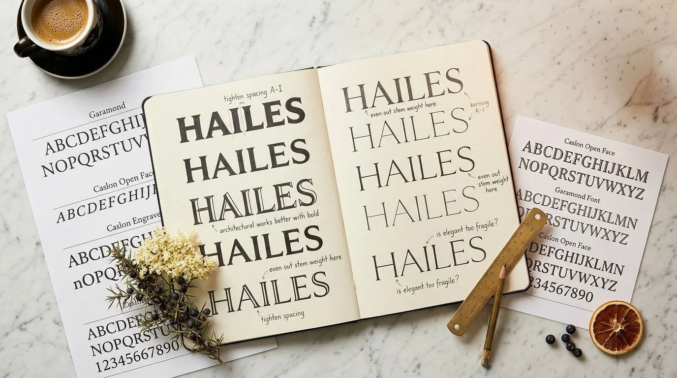 Type exploration — testing HAILES across different engraved serif forms before the wordmark was confirmed
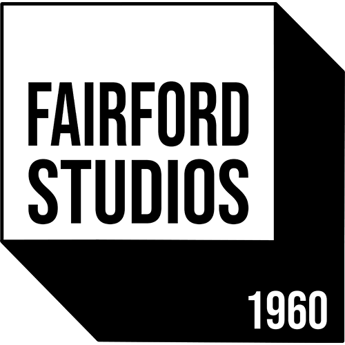
Hailes Abbey, Winchcombe
The ruins of Hailes Abbey still stand in the Gloucestershire Cotswolds — Cistercian gothic arches reclaimed by grass and wildflowers, limestone walls open to the sky. Walking the site, the botanical connection is immediate. Elder growing through the cloister floor. Wild marjoram on the south-facing walls. The smell of the landscape exactly as the monks would have known it.
 Hailes Abbey, near Winchcombe, Gloucestershire — founded 1246, dissolved 1539
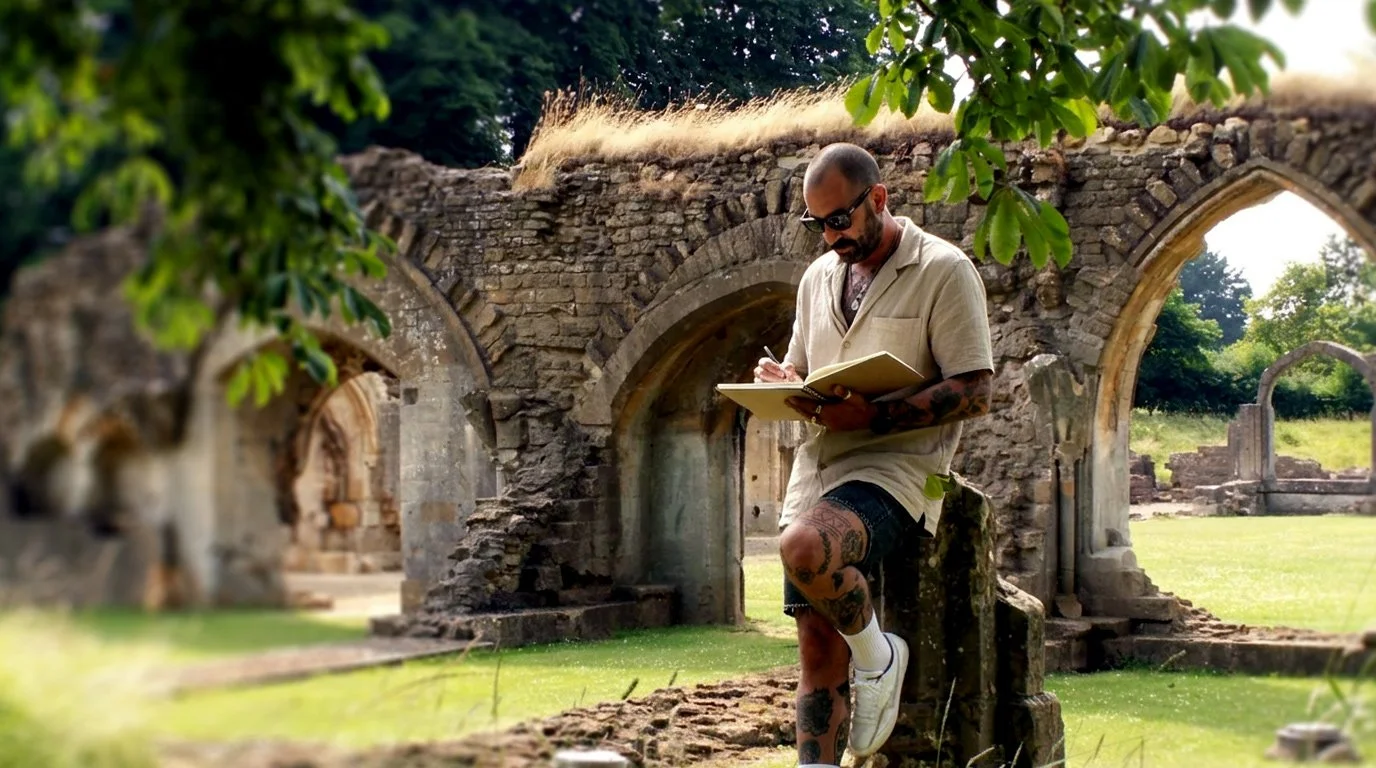 At the site — the designer in the landscape the brand comes from
Why Hailes
The name needed to sound like it had always existed before the gin was made. Not descriptive, not invented — discovered. Hailes earns its curiosity: someone picks up the bottle, asks where the name comes from, and the answer is a Cistercian monastery in the Gloucestershire hills whose monks cultivated botanical gardens for nearly three centuries before Henry VIII dissolved it in 1539.
That conversation is the brand working exactly as intended. Five letters. A founding date of 1246. The real date on the real label.
"The best gin names sound like they existed before the gin was made. Not designed — discovered."
Building the label
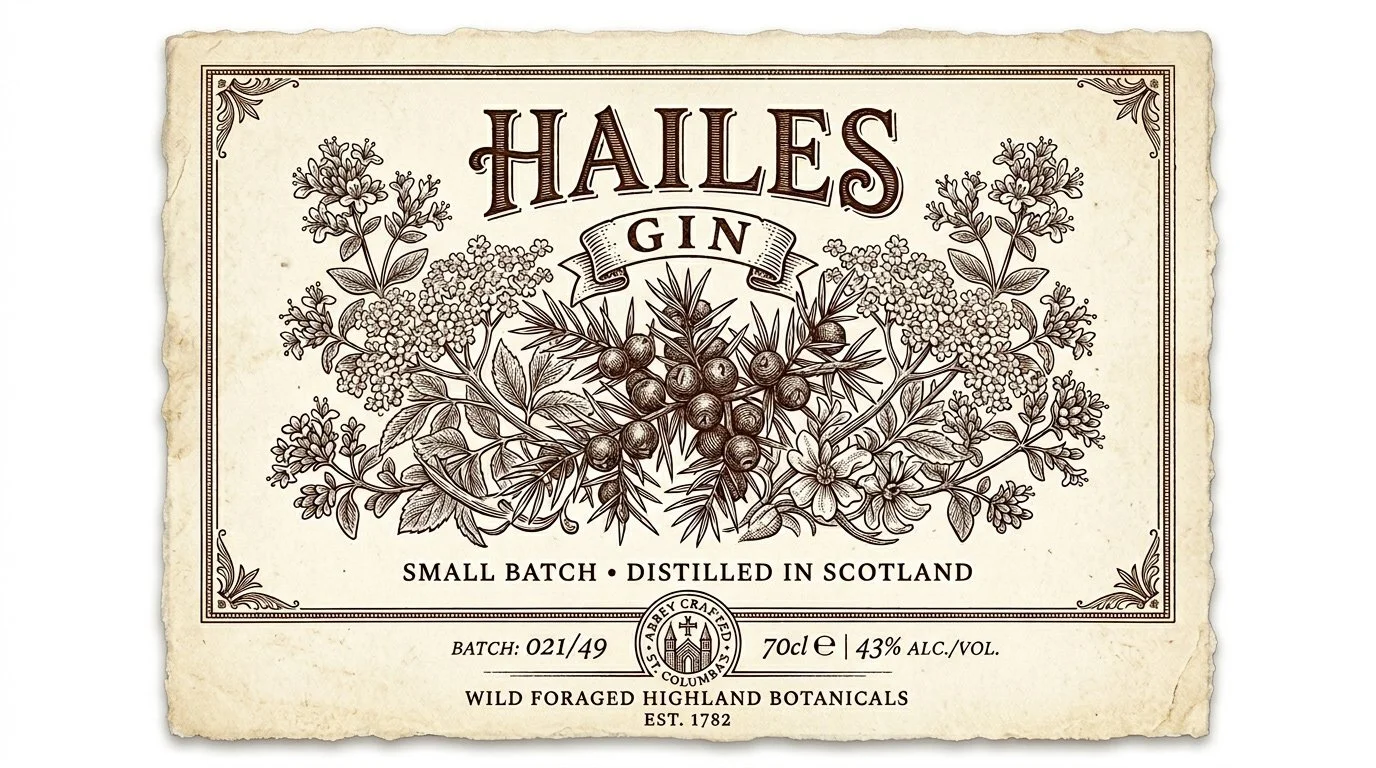
The label architecture draws directly from the copper engraving tradition of Blackwell's A Curious Herbal. HAILES in a tall, stone-cut engraved serif. A central botanical illustration of juniper berries flanked by elderflower and wild marjoram — rendered in dense cross-hatching linework. A gothic arch monastery device as the quiet anchor. The label is a page from a herbal that happens to be wrapped around a bottle.
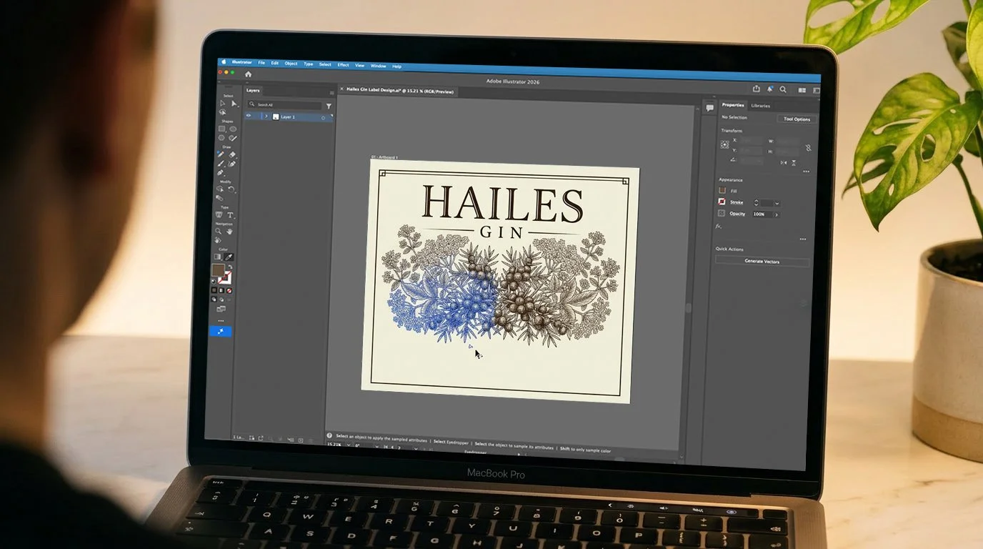 Building the label in Adobe Illustrator — the botanical illustration and typographic hierarchy taking form
 Test label — first print proof before final production
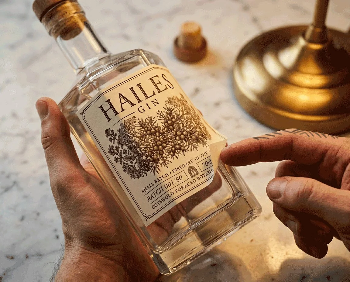 The first time the label exists as a physical object — applied to the bottle
Analogue first
Every design decision started on paper — the label hierarchy, the bottle form, the type explorations. The sketch establishes the logic before Illustrator opens.
Typography — the stone-cut wordmark
HAILES in Cormorant Garamond, sized and spaced to feel permanent rather than designed. GIN in tracked small capitals beneath. The relationship between those two words is the entire label architecture.
The botanical illustration
Juniper berries at centre, elderflower and wild marjoram spreading either side. Built in the Elizabeth Blackwell cross-hatching tradition — observed, precise, dense. The illustration that earns the founding myth.
The monastery device
A small gothic pointed arch, centred at the label base. Drawn with the Pen Tool to the same weight as the border rule. Not a logo — a mark of origin. It whispers the monastery, it doesn't announce it.
Hailes in the world
A tall, thin hexagonal clear glass bottle — the form referencing both the Dutch case gin bottle (jenever was transported in angular vessels) and the apothecary vessel tradition. The wooden cap over a natural cork creates a moment of ritual before the bottle is even open. The label sits flat on the hexagonal facet, exactly as the engraving it references would sit on a page.
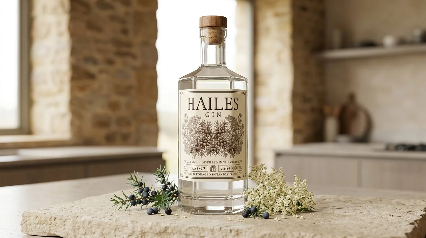 Hailes Gin — hexagonal clear glass, wooden cap closure, cream botanical engraving label on Cotswold limestone
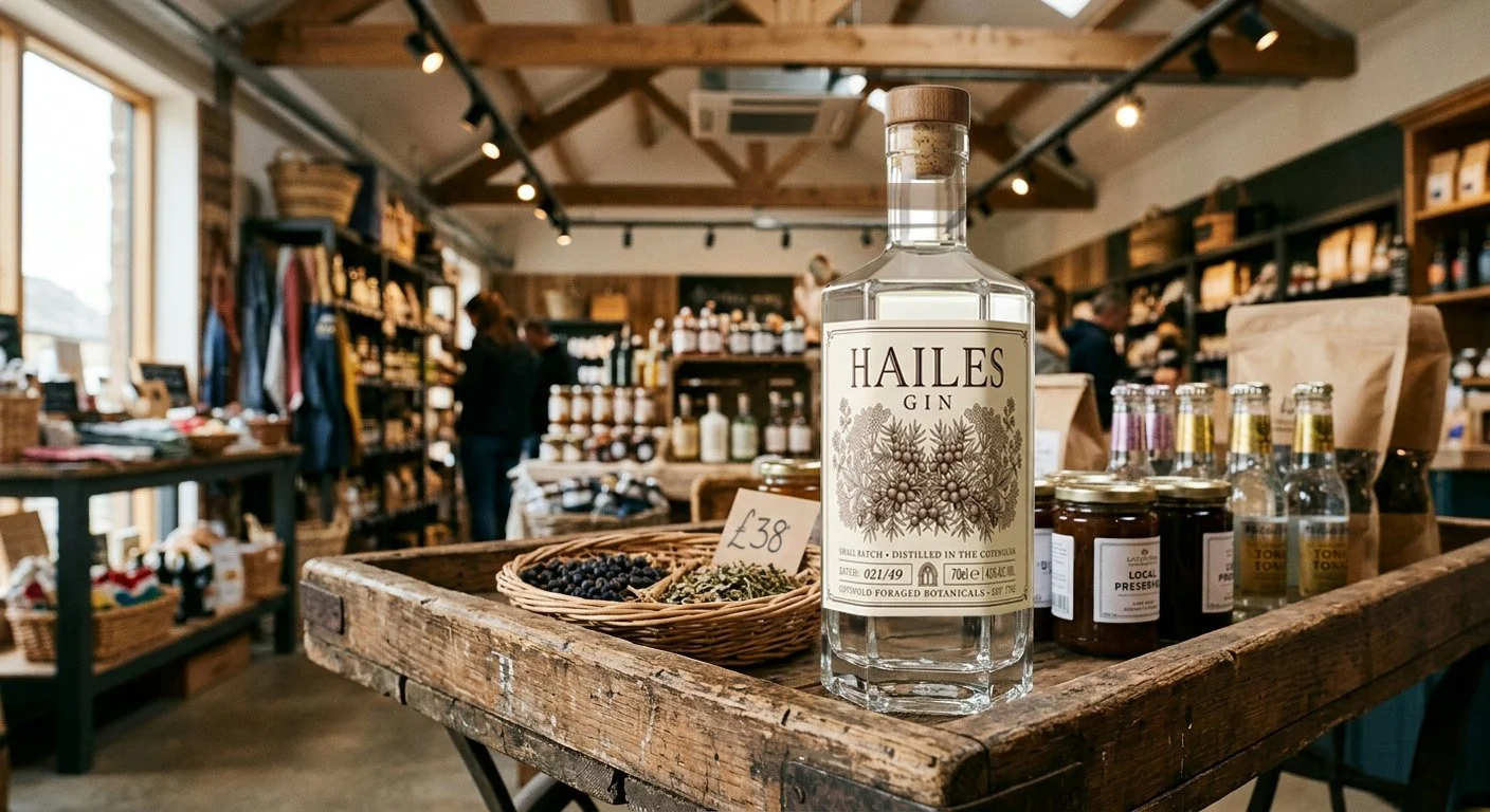 The retail world Hailes belongs to — artisan farm shop, craft producers, Cotswolds provenance
The brand in one sentence
A Cotswolds gin distilled from botanicals gathered from the same limestone hills that Cistercian monks cultivated for nearly three centuries — designed by a studio with sixty years of craft behind it, for the independent producers who understand that the bottle is as important as what's inside it.