

Small roads, big skies, one rider. France from the back of a van.
Project 21|12 was James riding the Tour route to raise money for Great Ormond Street Hospital, with me in the support van with a camera. Small roads, big climbs, early starts, late finishes, and a lot of quiet moments in lay-bys. Then Paris, to stand at the barriers and watch the pros finish the real thing.
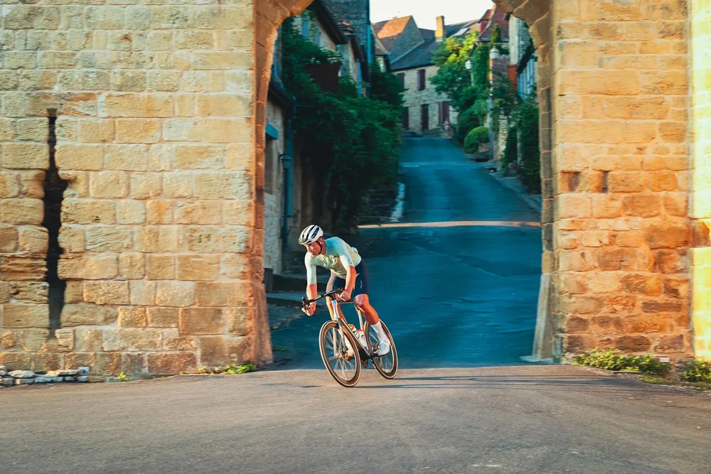
This piece takes those photographs and runs them through five ways people have shown speed, landscape and effort over the last hundred-odd years. Each chapter steps further back in time, from the 1950s to the very first Tour in 1903, and each one comes with the reason why. Drag the line on each image to see where it started.
The road
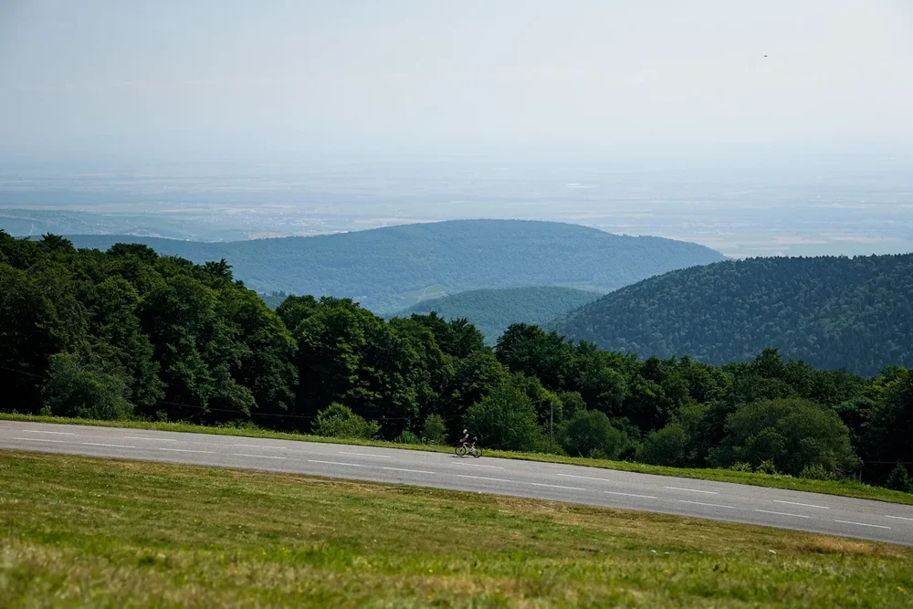
Long days, small roads, one rider.
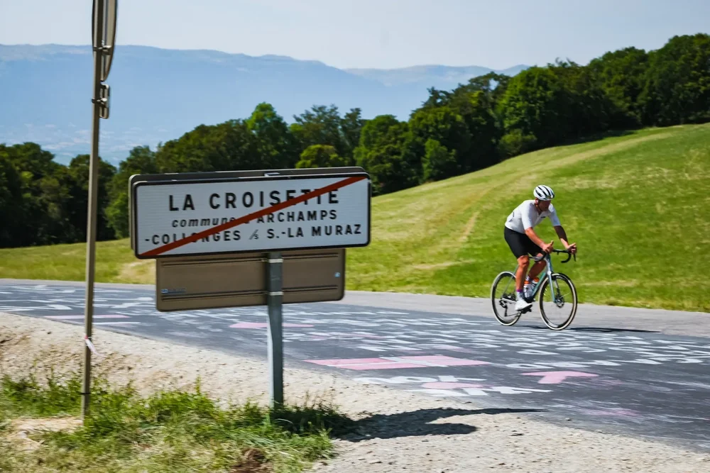
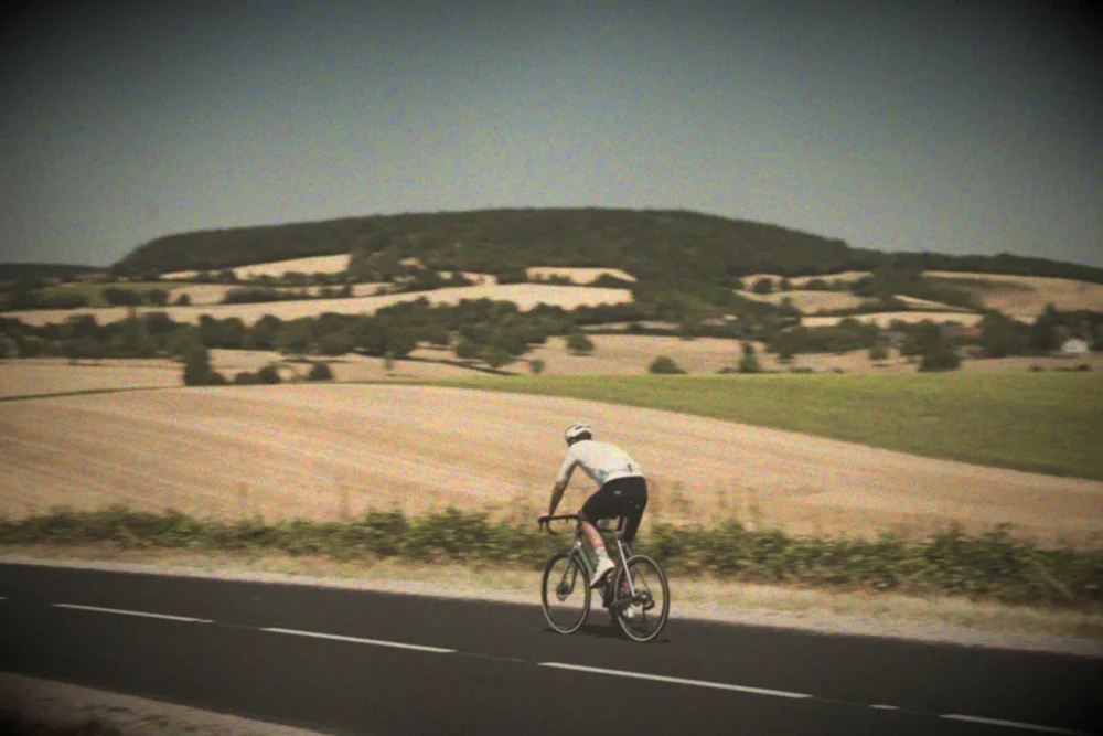
Smear
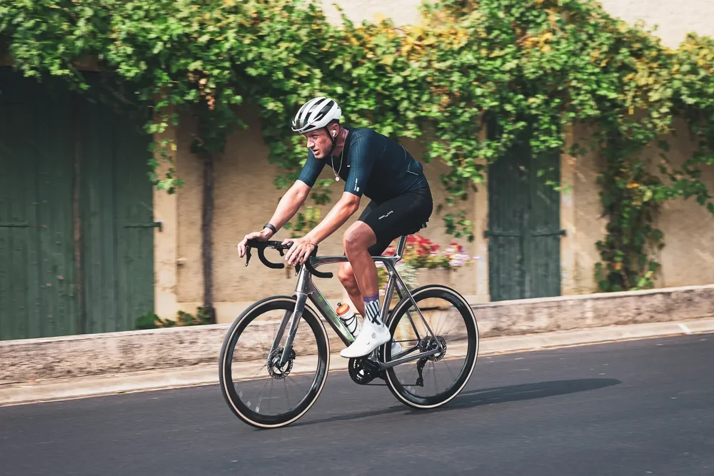
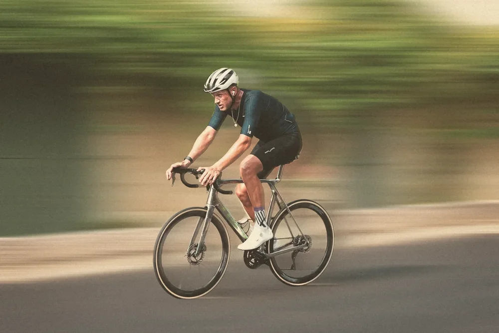
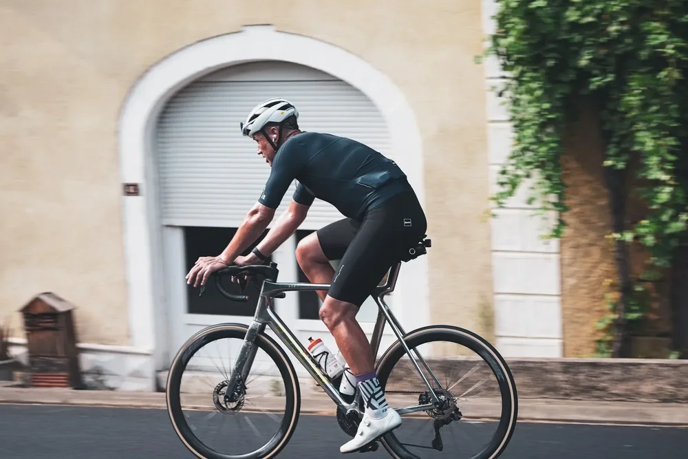
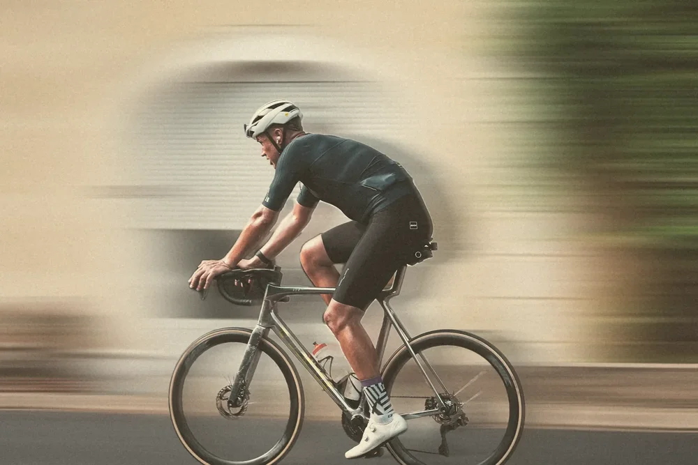
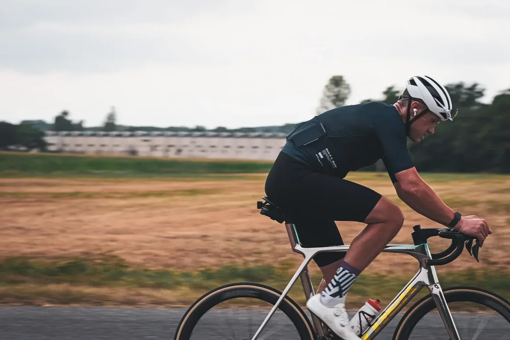
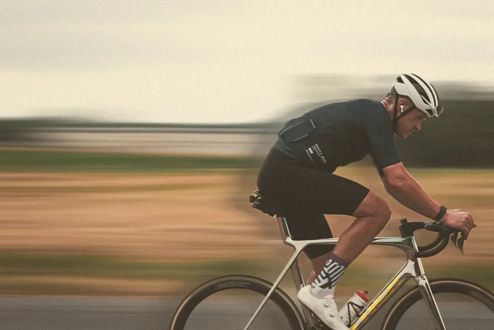
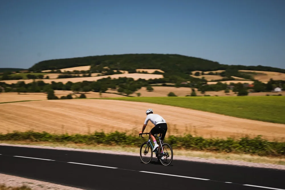
Ernst Haas turned blur into a colour language in the 1950s, dragging his shutter until the world dissolved into paint. It is how a long day on the bike is actually remembered: villages, vines and walls reduced to streaks of colour, and the rider the one fixed point in it all.
James stays sharp, cut out frame by frame, and everything around him is pulled into long lines. Warm cream base, lifted blacks, fine grain.
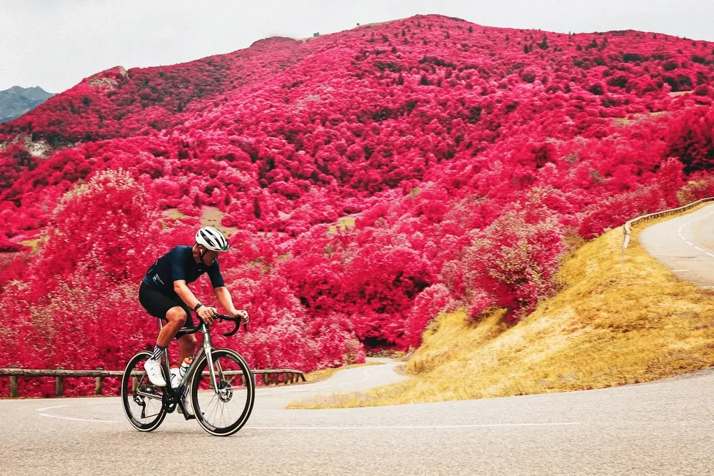
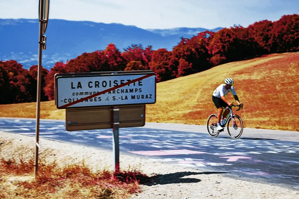
Aerochrome
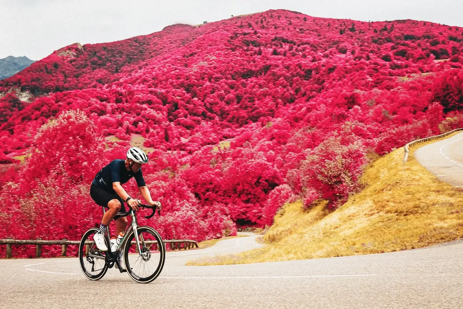
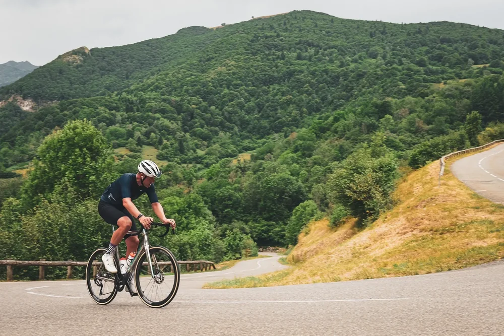
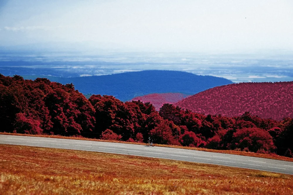
Kodak made Aerochrome to find camouflage from the air. Healthy leaves reflect infrared light that paint and netting do not, so on this film the living landscape glows red. Kodak stopped making it in 2009, and the few rolls left are some of the most sought-after film in photography.
Every tree, hedge and meadow is mapped through crimson and pink. The rider, the road and the sky stay true, so the person is the only thing that looks normal.
Paris
Where the race has ended almost every year since 1903.
Silver Speed
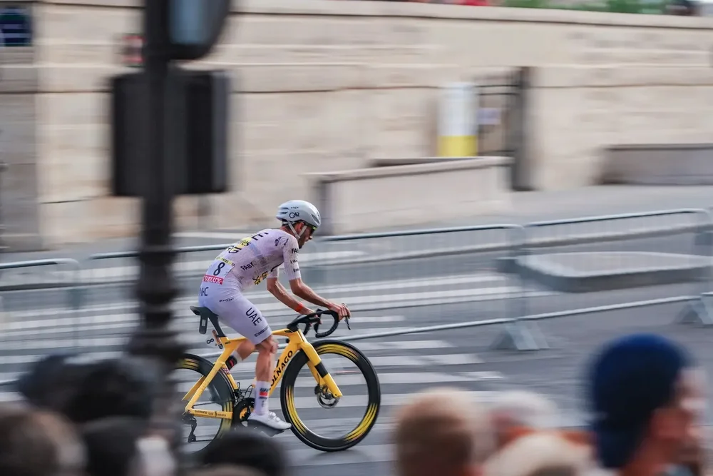
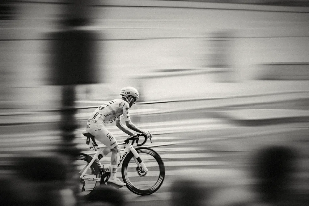
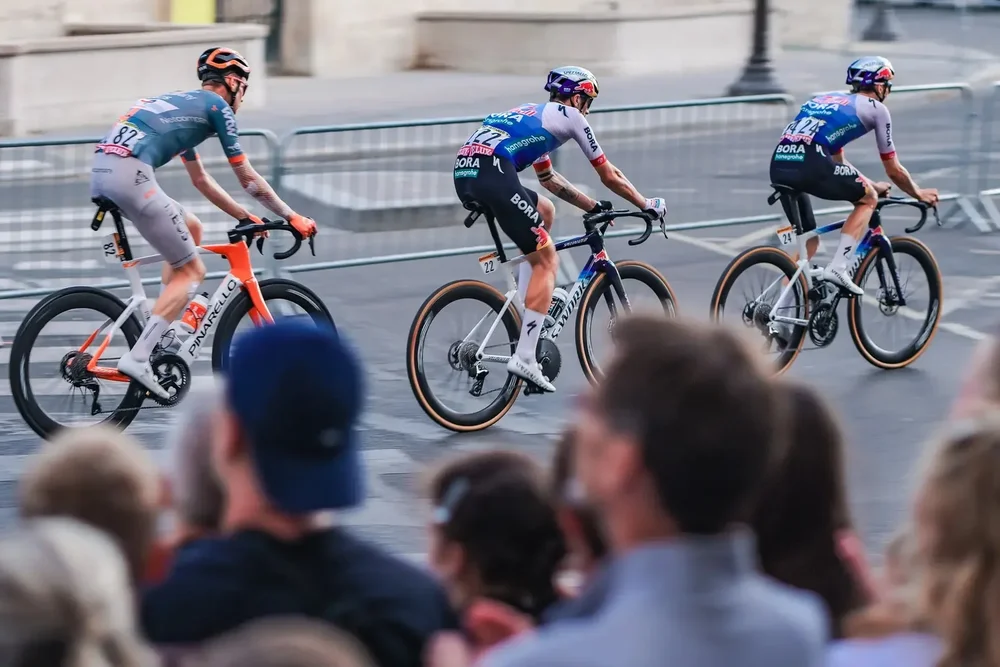
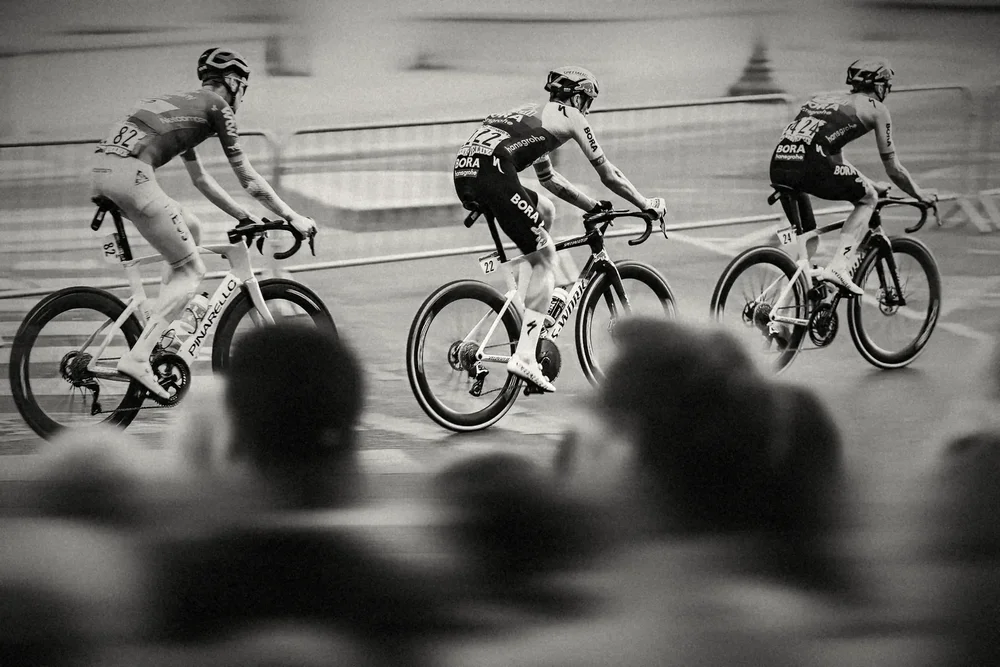
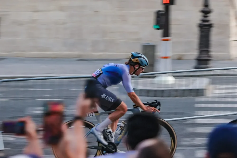
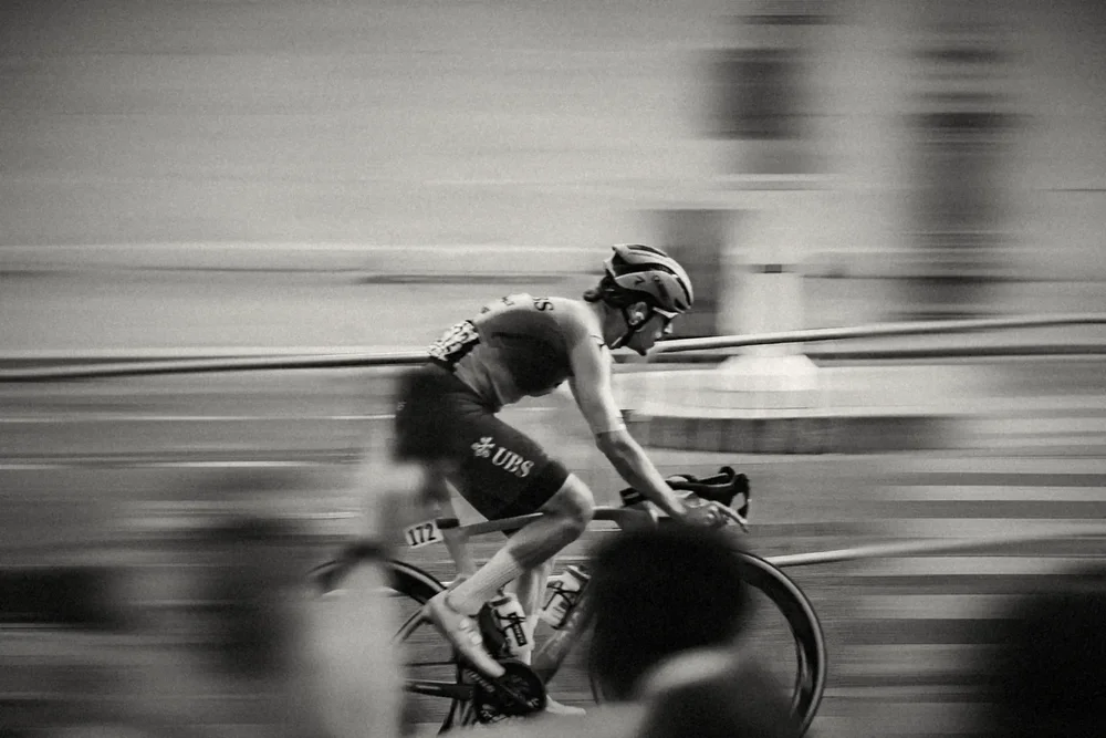
In 1912 Jacques-Henri Lartigue photographed a Grand Prix car with a shutter that crawled down the frame, and the car came out stretched and leaning forward. It became the picture of speed. Paris is where the Tour has finished almost every year since the first edition, and the crowd at the barriers is as much a part of the finish as the riders.
The riders stay sharp and the city is dragged behind them: barriers, lamp posts and the crowd melting into silver. Deep blacks, fine grain.
France
The country the race was built to show off.
Autochrome
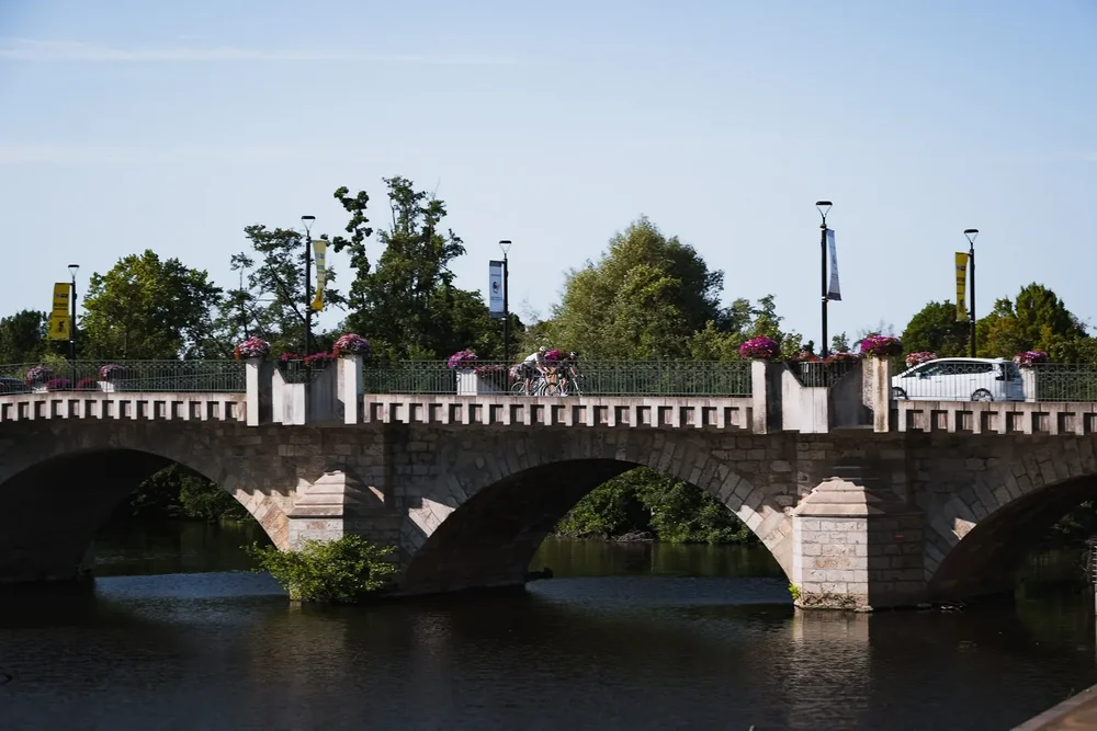
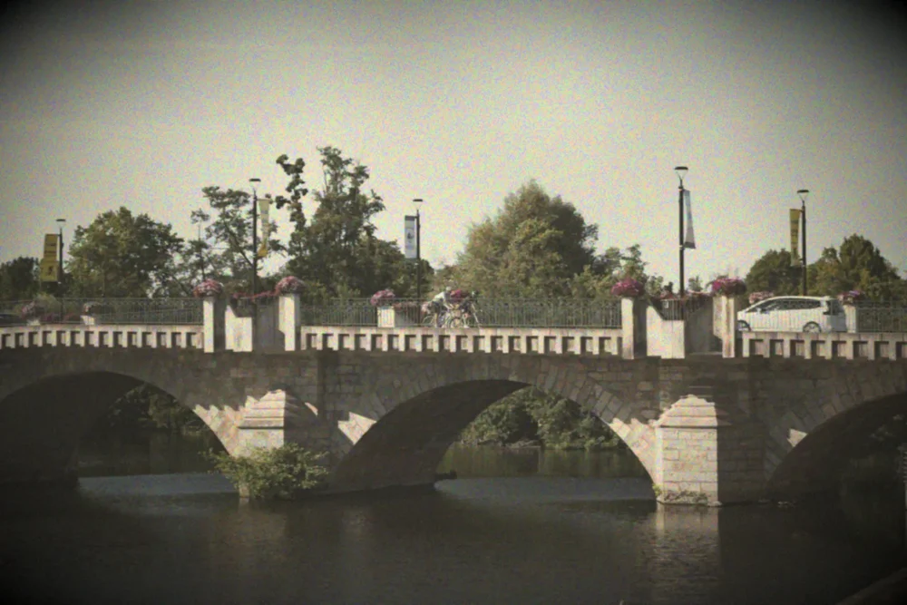
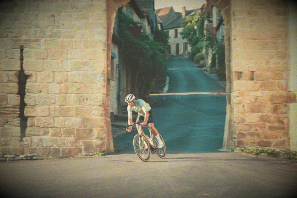
The Lumière brothers launched the Autochrome in 1907, four years after the first Tour. Each plate was coated in potato starch grains dyed orange, green and violet, which is why the colours look like they were painted with a fine brush. From 1909 the banker Albert Kahn sent photographers across France and the world with them, the first time much of the country was seen in colour.
Soft pastel colour, lifted shadows, a visible speckle of dye grains and a gentle fall-off at the edges.
The cost
What the miles take out of you.
Halftone and hand tint
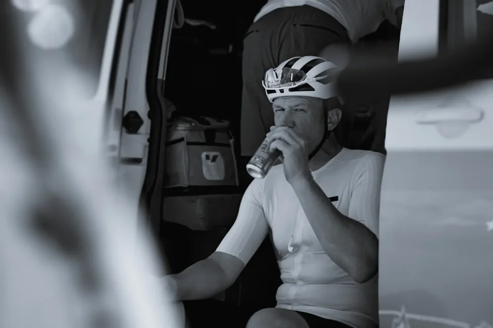
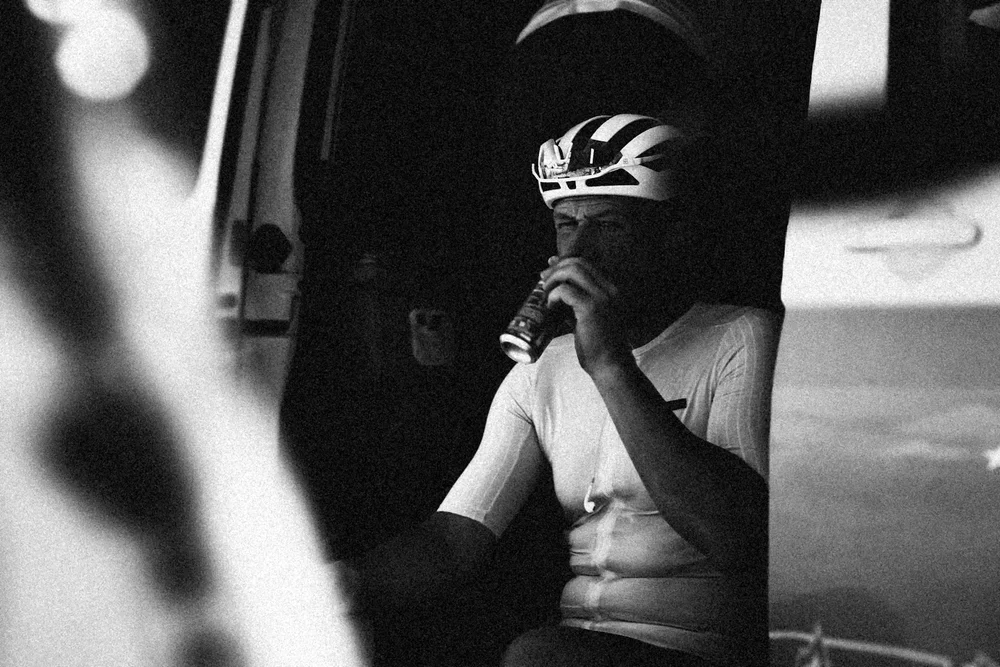
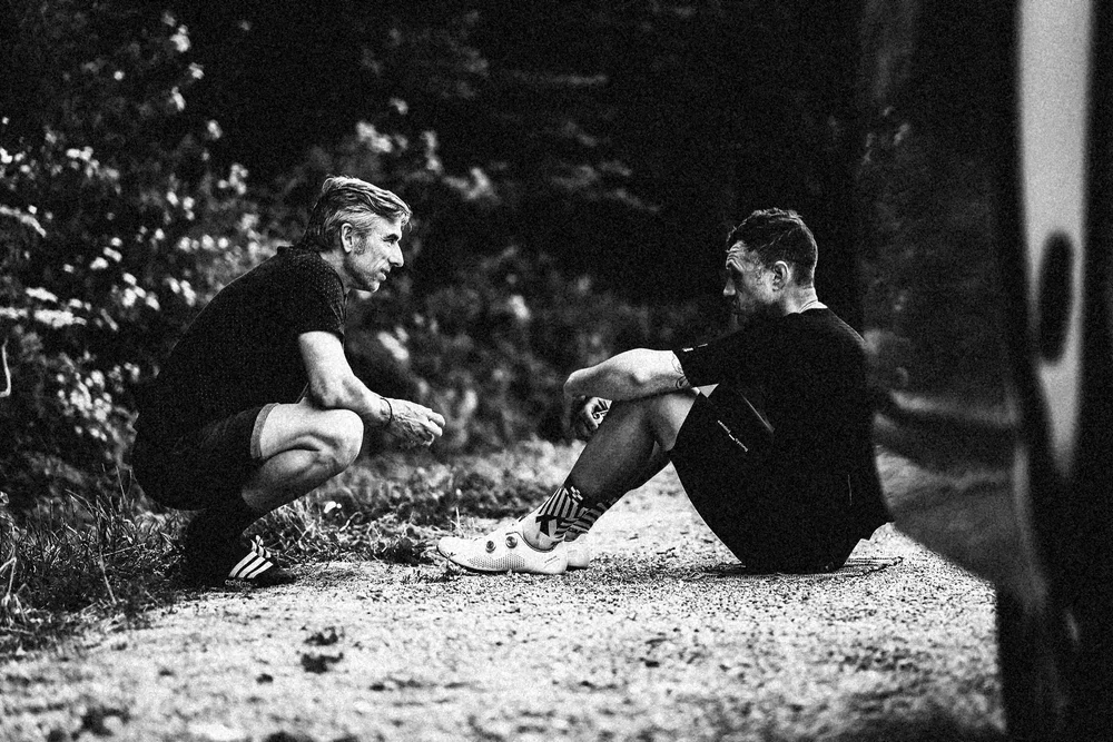
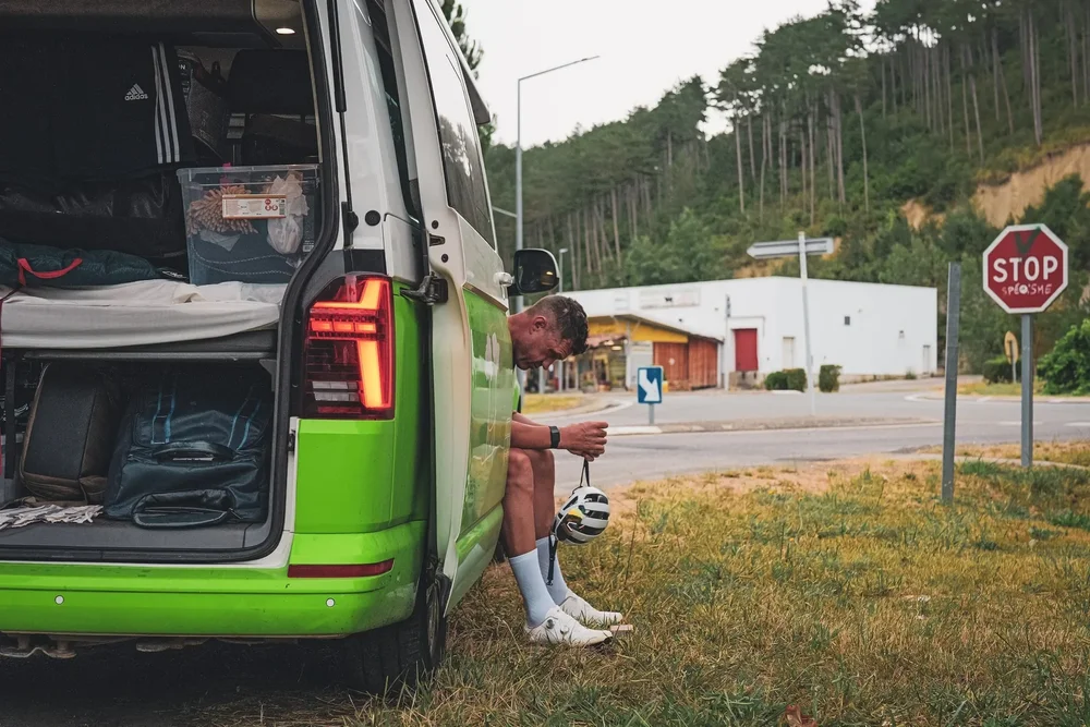
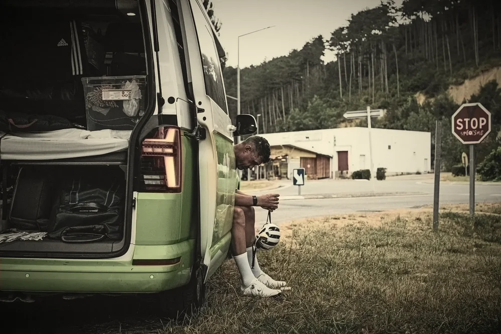
The Tour de France was invented by a newspaper. L'Auto created the race in 1903 to sell more copies, and for decades people followed it through grainy halftone photographs on cheap paper: riders covered in dust, sitting on kerbs, staring at nothing. Before colour film, studios added colour by hand with brushes and dyes, a few soft washes over the black and white.
Two frames in hard newsprint black and white, crushed shadows and heavy grain. The third is hand tinted: a warm silver print with faded washes of colour where the van and the stop sign were.
More from the road
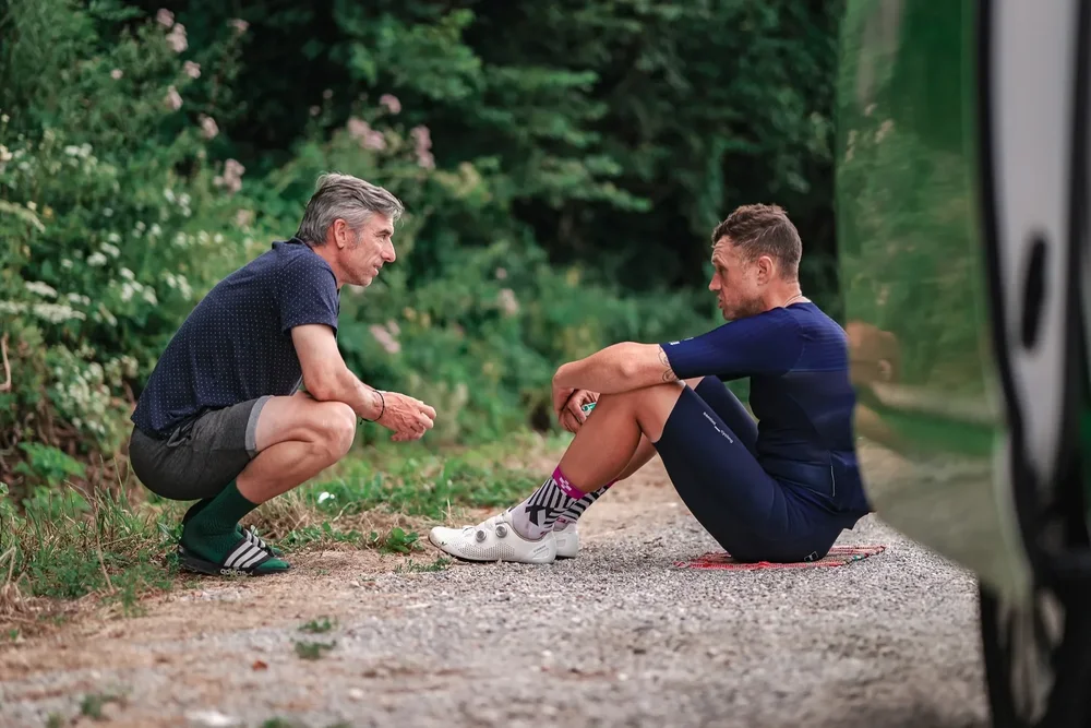
The same treatments on more of the summer, plus Silver Speed left in colour for the Paris finish. Tap any frame to see it full size.
See the untouched work
More from the journal: Printed at Speed and the Rosso Study.