

Printed at speed.
One day on the spectator banks at Silverstone, printed three old ways. Each treatment borrows from a moment in the history of photography or racing, and each one comes with the reason why.
Speed, power and engineering, told the way they used to be printed.
The Rosso Study was about feeling: smear, contrast, one obsessive red. This one is about where the pictures come from. Every racing photograph today sits on top of a century of people working out how to show something moving faster than the eye can follow.
So instead of inventing filters, I went back to three of them: a teenager's happy accident, the blue of the engineer's drawing board, and the flat inks of the old race posters. Drag the line on each image to see where it started.
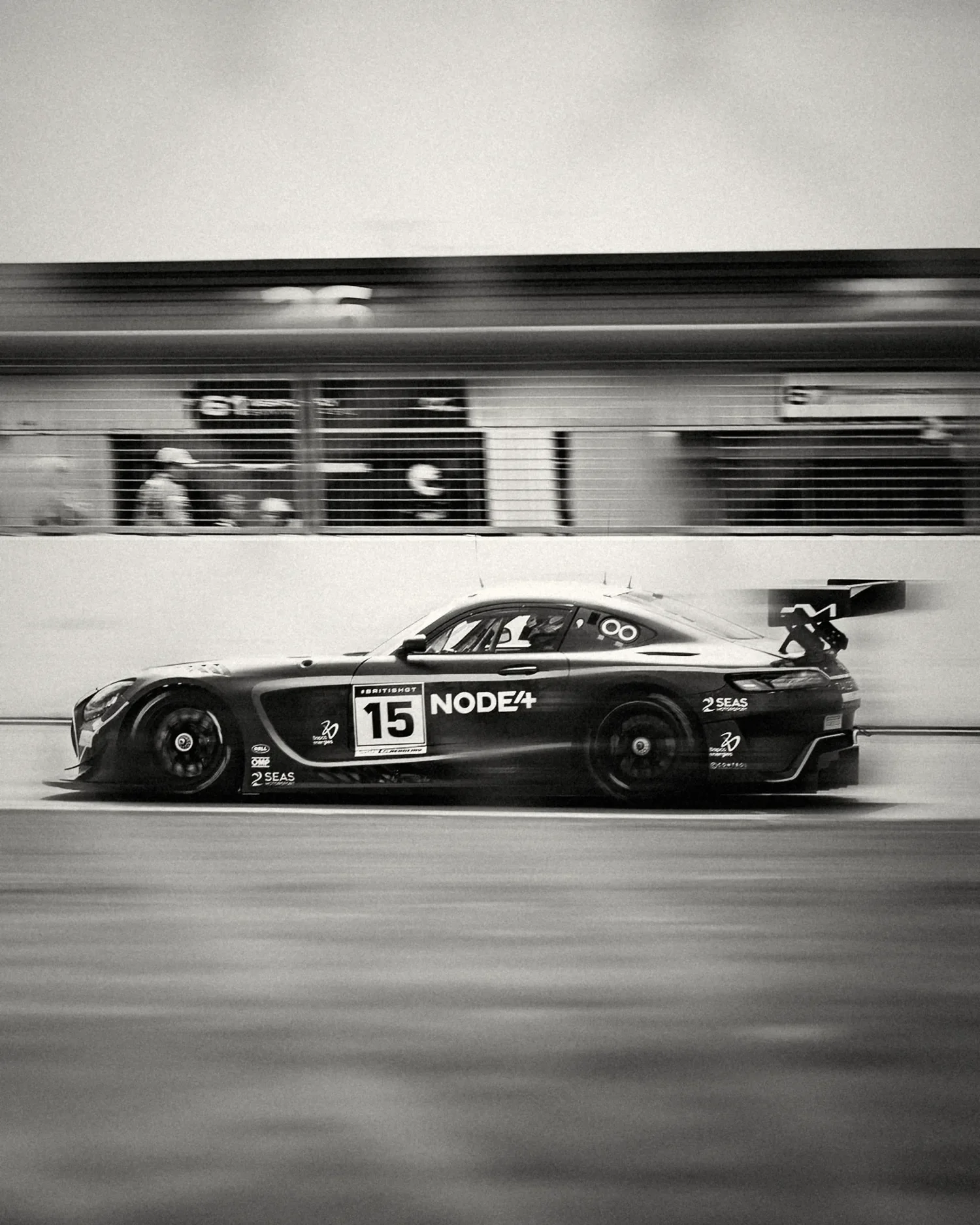
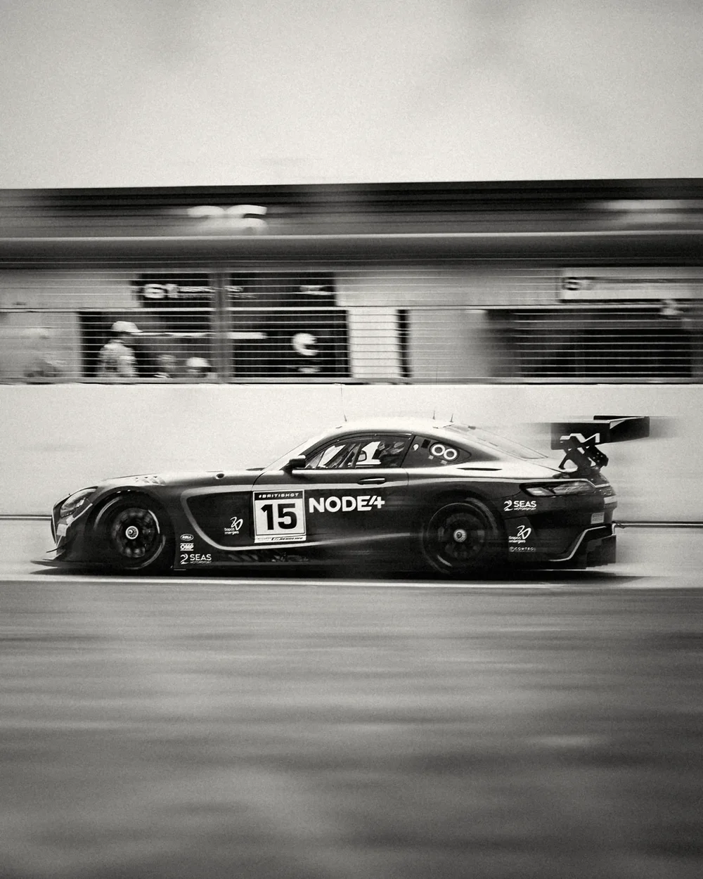
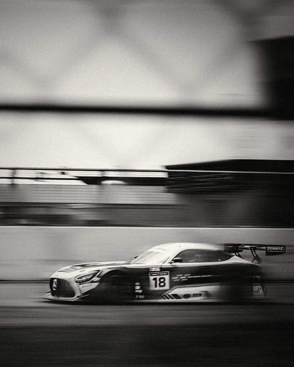
Silver Speed
In 1912 an eighteen-year-old Jacques-Henri Lartigue stood beside the Grand Prix at Dieppe and swung his camera after a passing Delage. His shutter was a slit that travelled down the frame, so by the time it reached the wheels the car had moved on. The car stretched forward, the wheels leaned into ovals and the spectators leaned the other way. By every rule of the day the picture was a mistake. It became the image of speed.
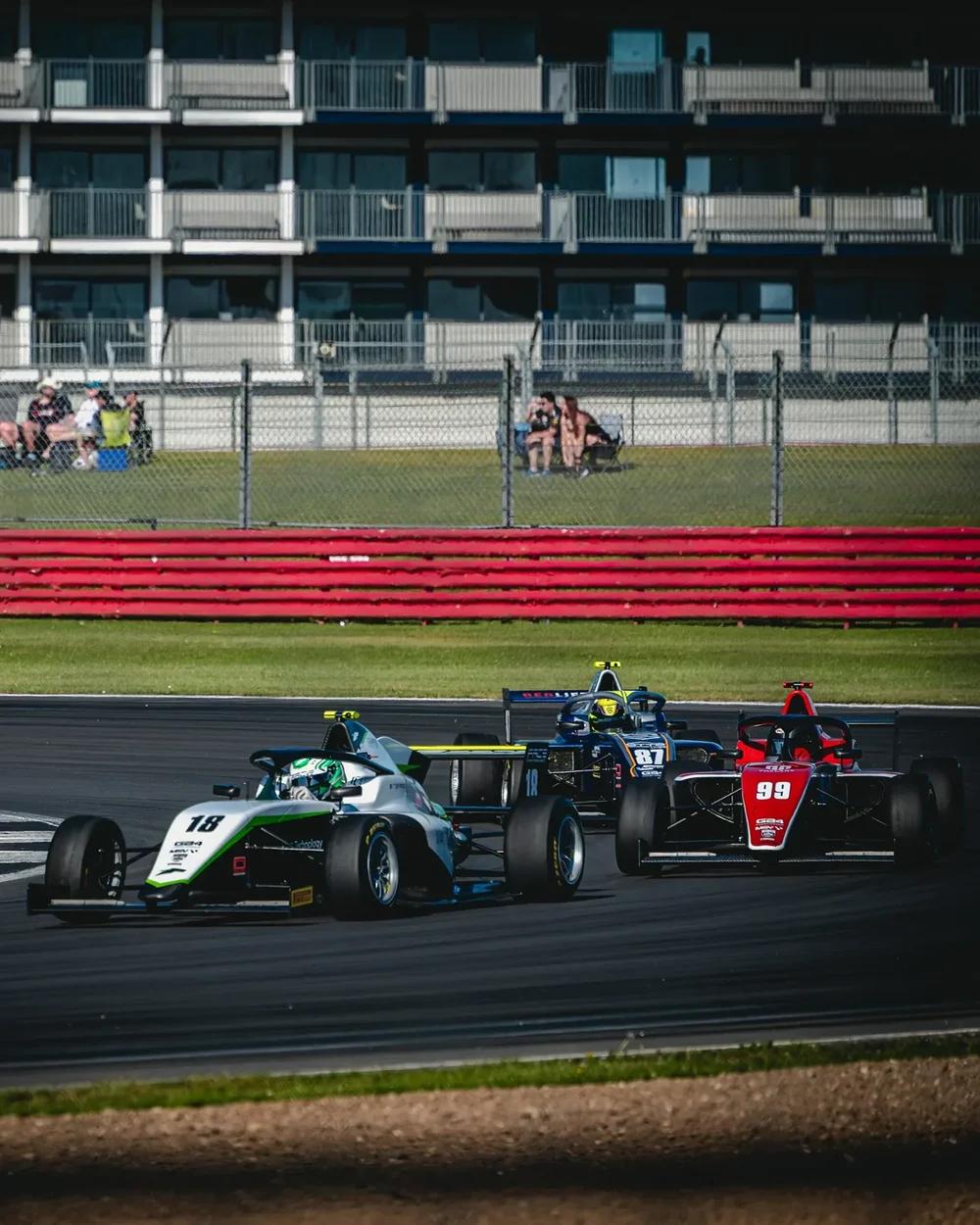
Here the car stays sharp and the world gets pulled out of the way: the pit wall, the fence and the tarmac dragged into long lines, printed in deep silver with inky blacks and fine grain.
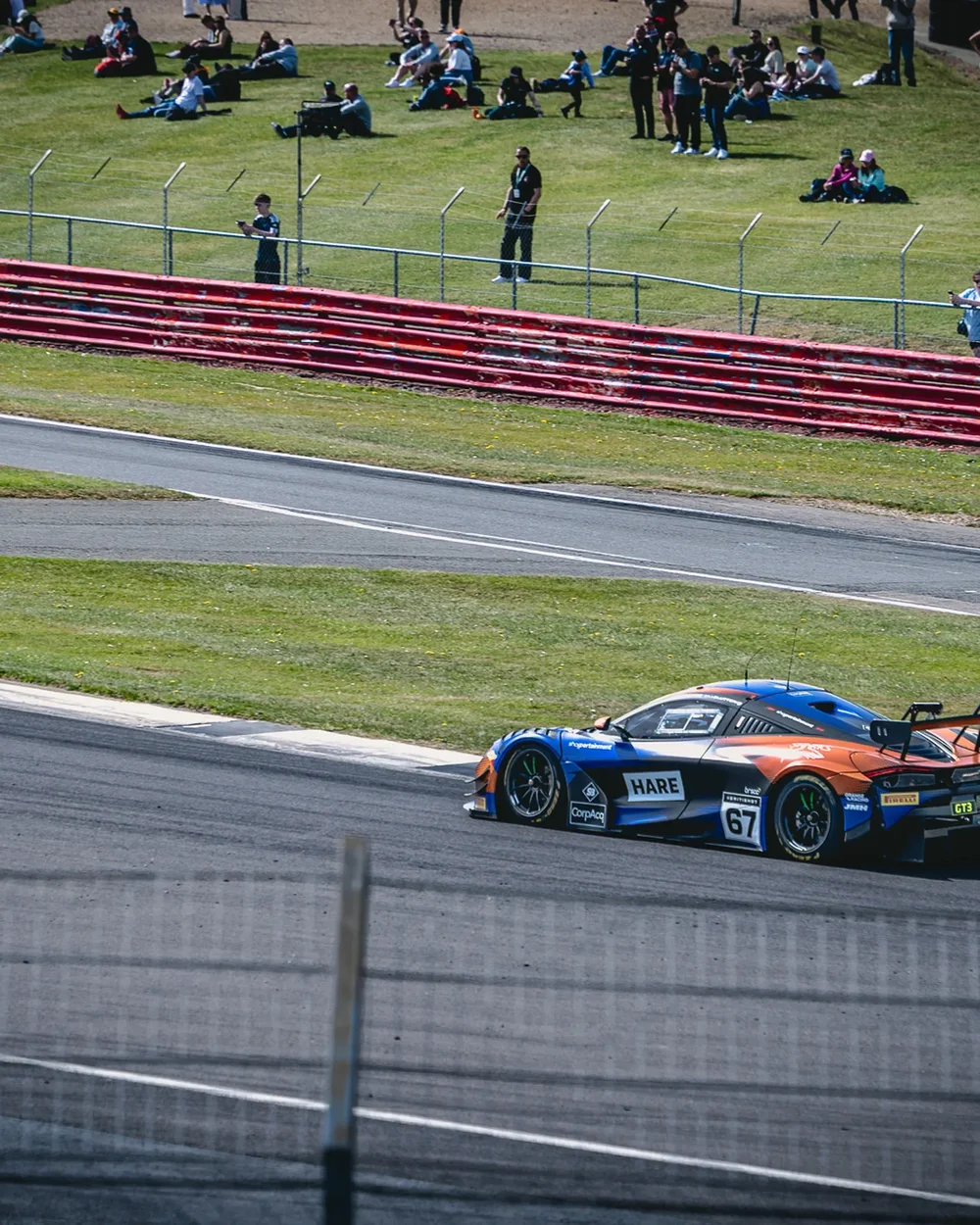
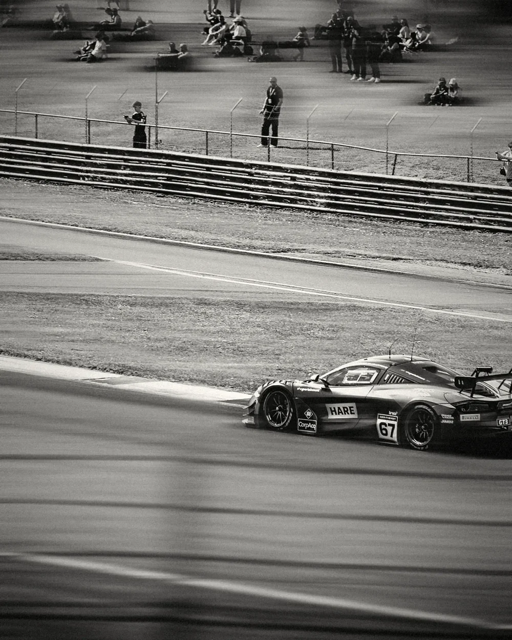
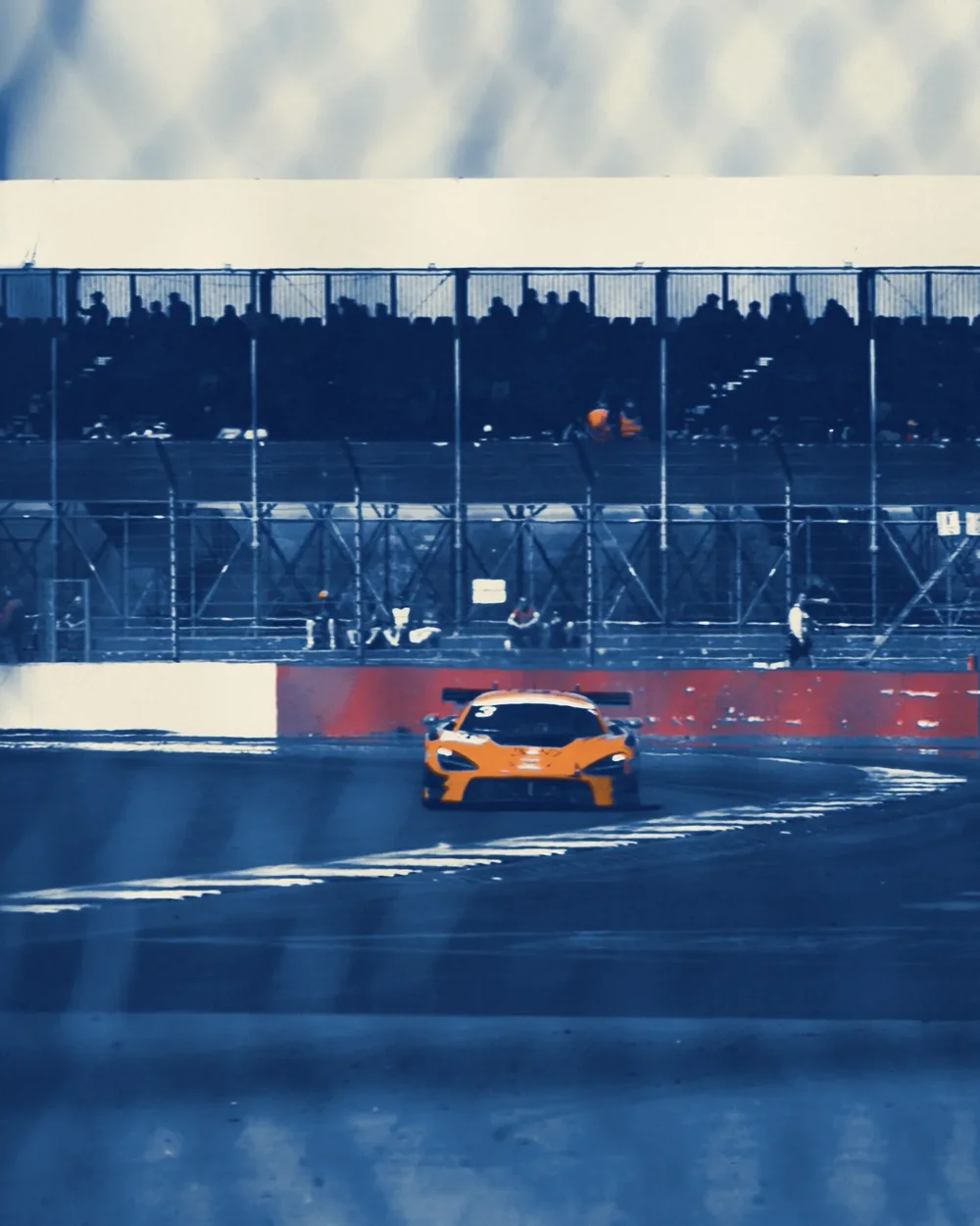
Cyanotype
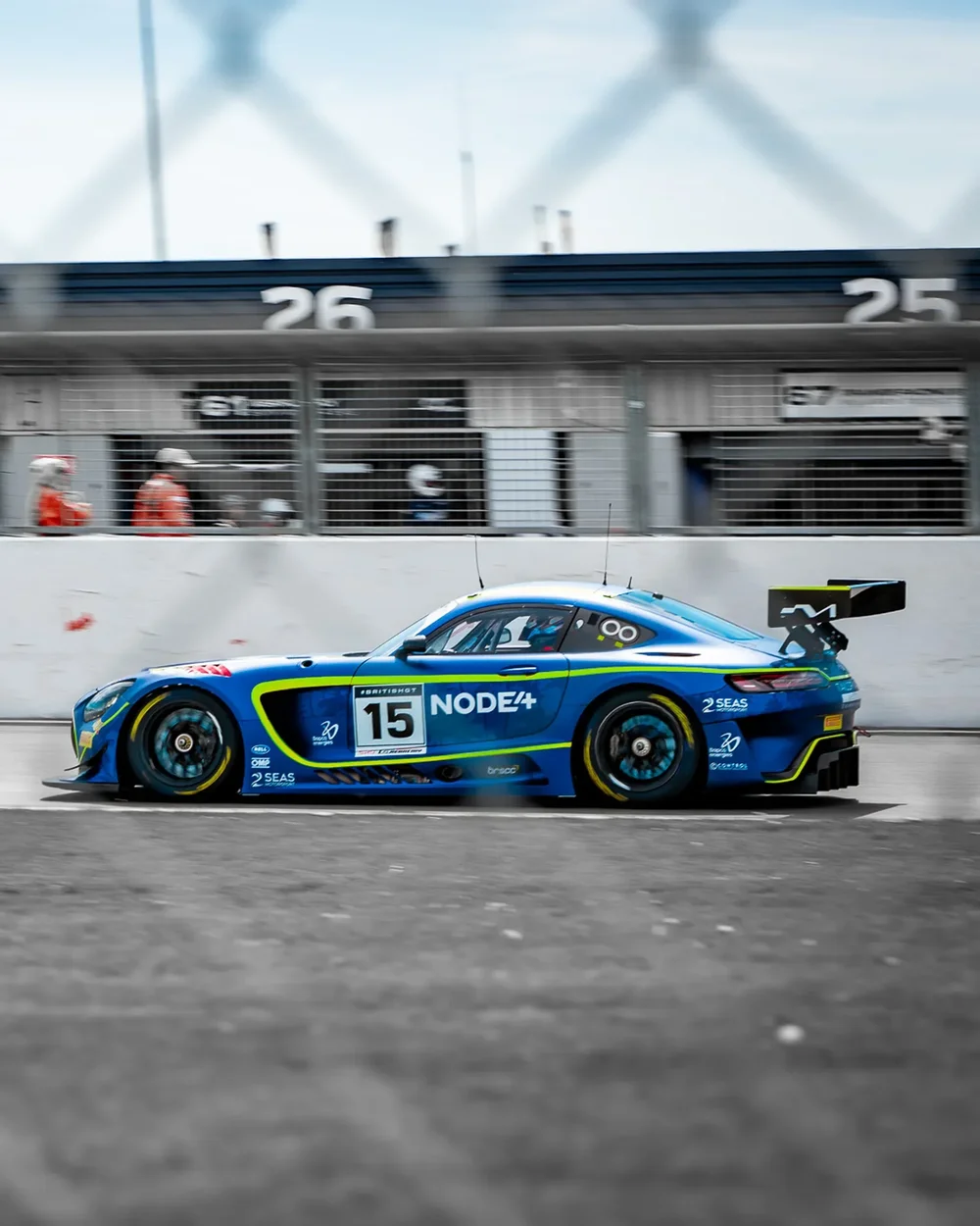
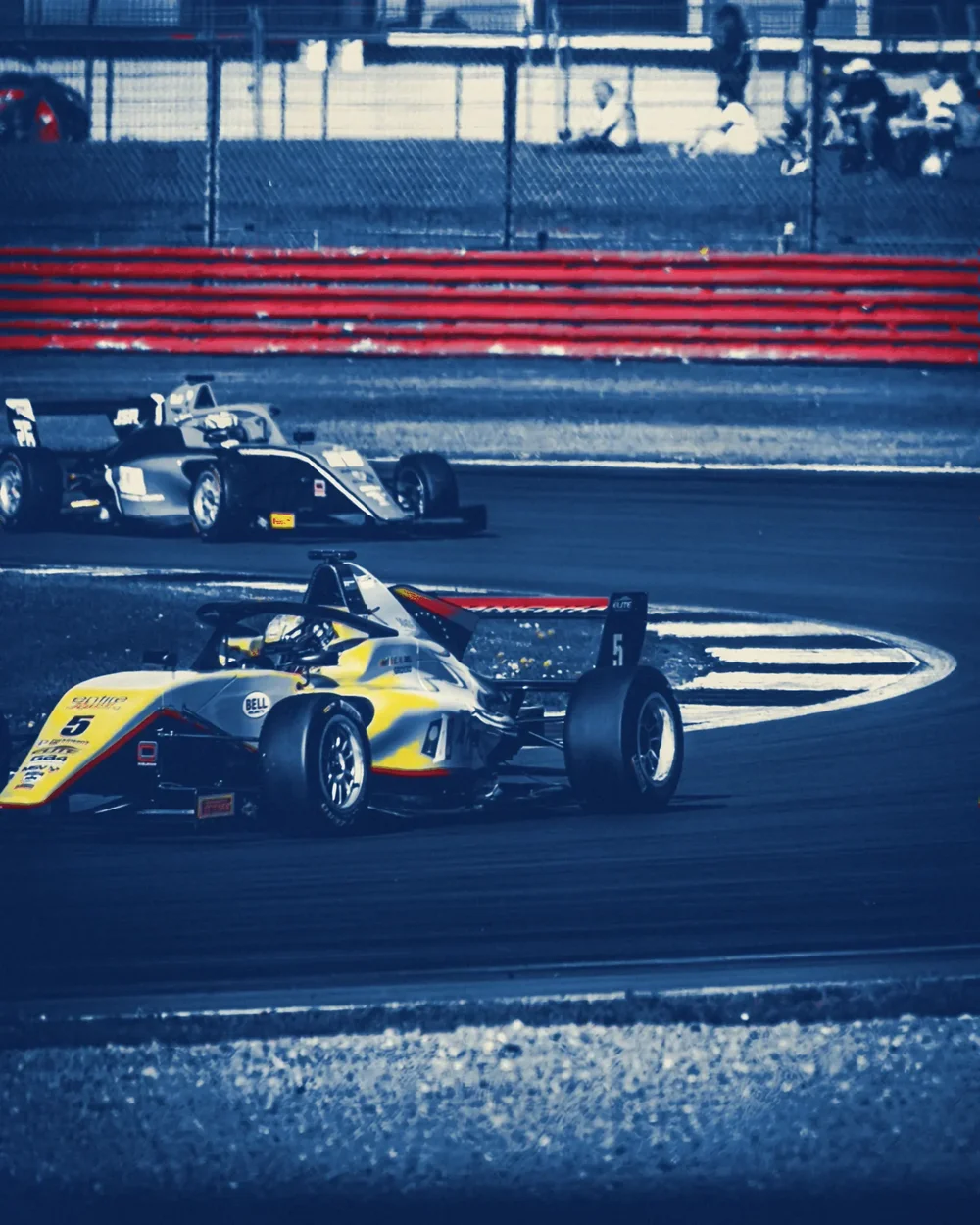
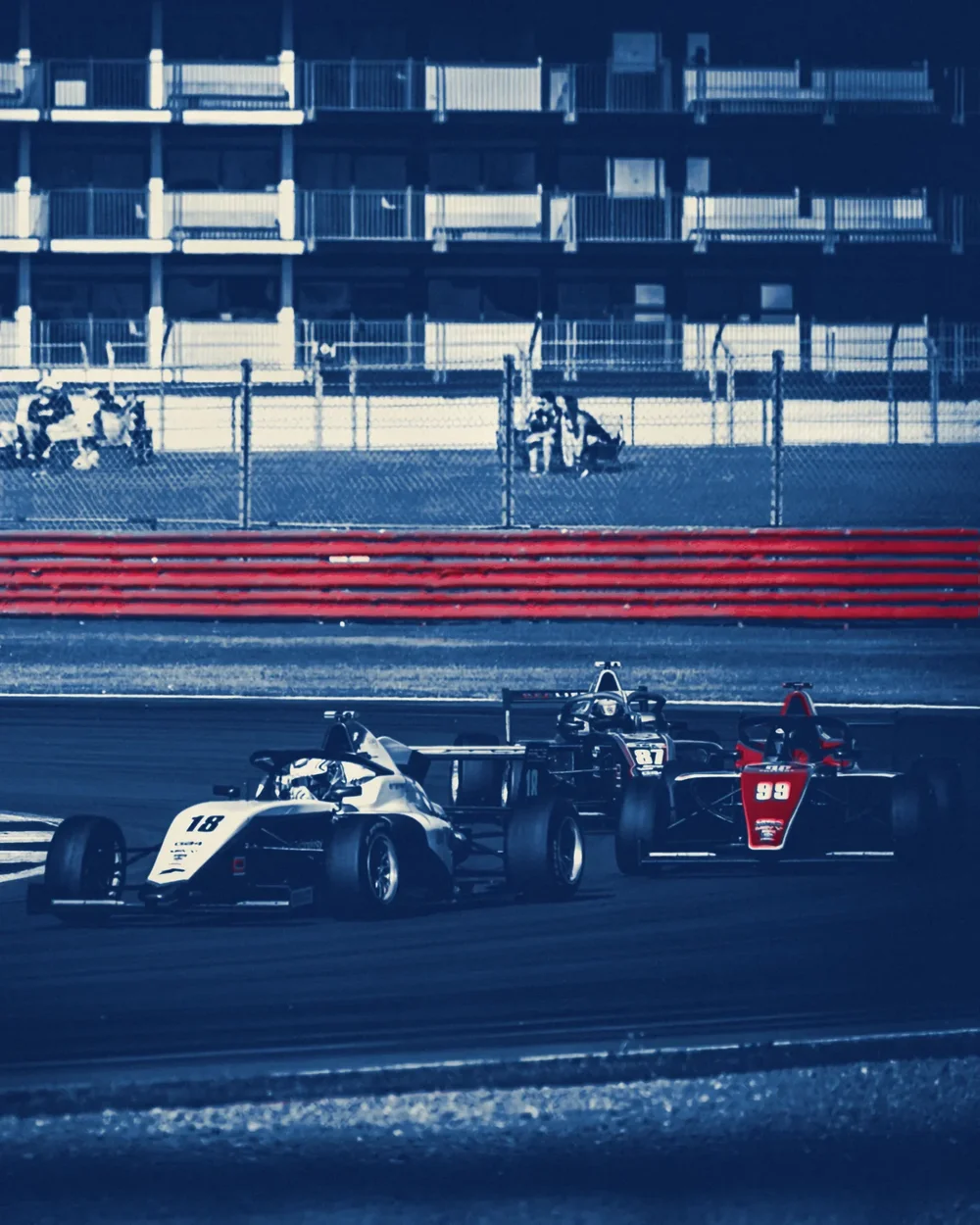
Sir John Herschel found the cyanotype in 1842: paper brushed with iron salts, laid under a negative and left in the sun, then washed in water until the image came up Prussian blue. It was cheap and it lasted, so for the best part of a century engineers used it to copy their drawings. That is where the word blueprint comes from, and how the race cars of the post-war years were drawn and passed round the workshop.
Around 1900 printers started brushing colour over the blue with gum bichromate, one hand-coated layer at a time, never quite lining up. I have done the same here: the blue does the structure, and a gum layer brings back only the colours that matter, the livery and the barrier.
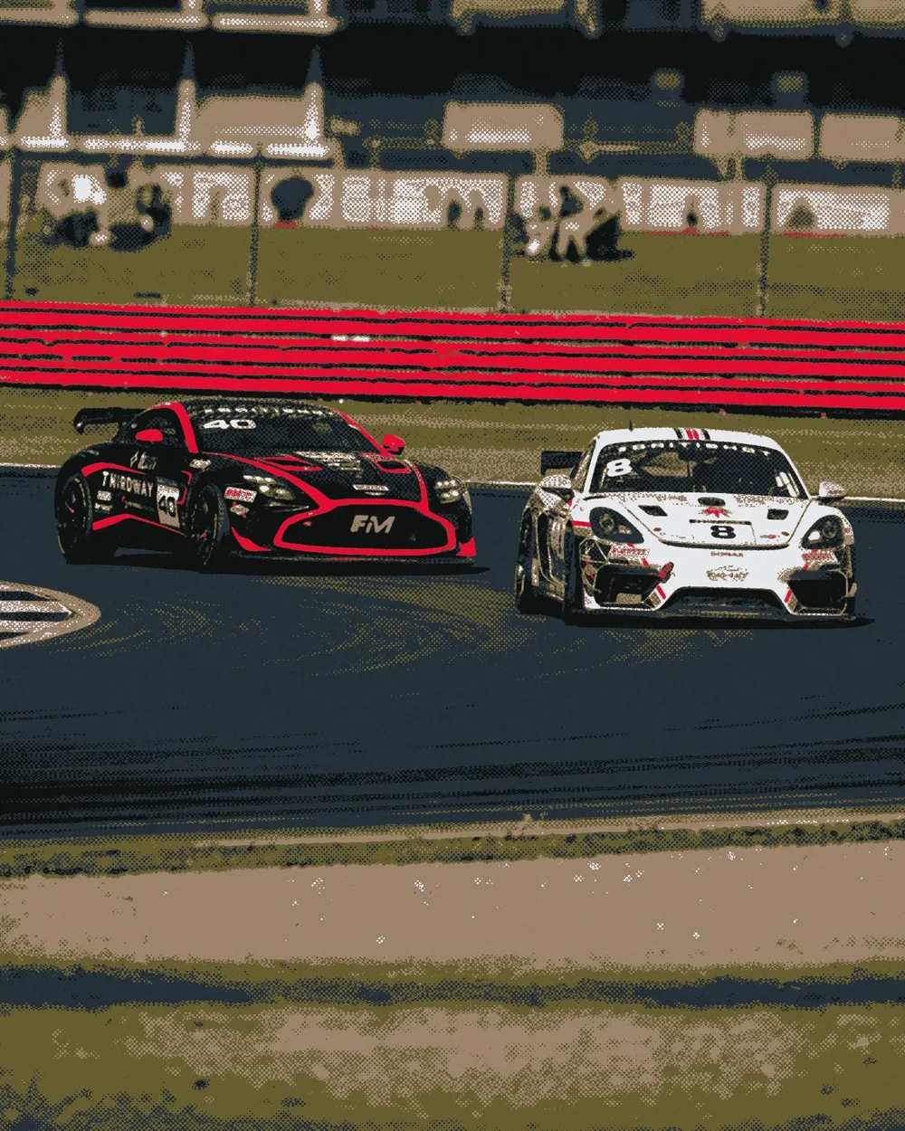
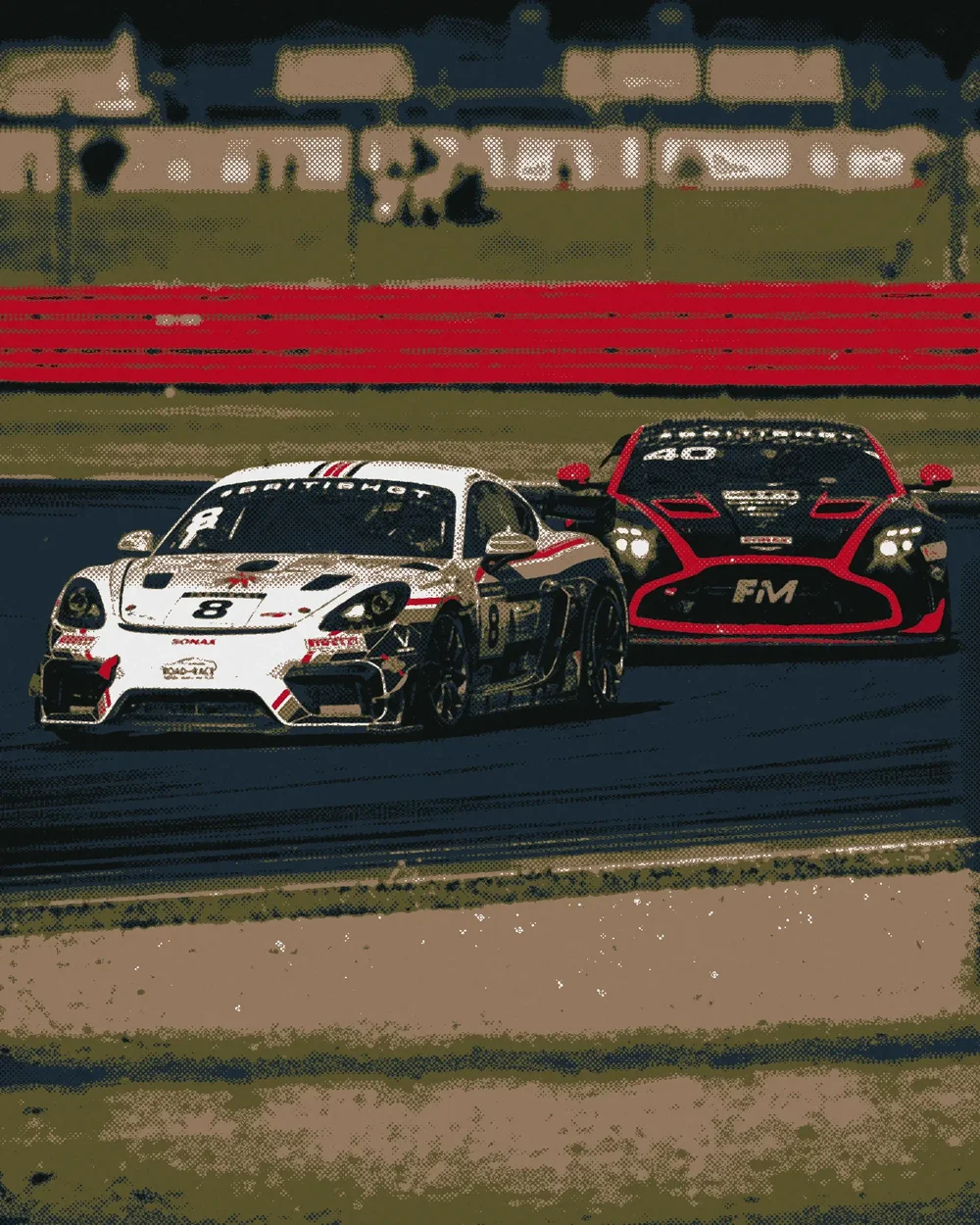
Race Poster
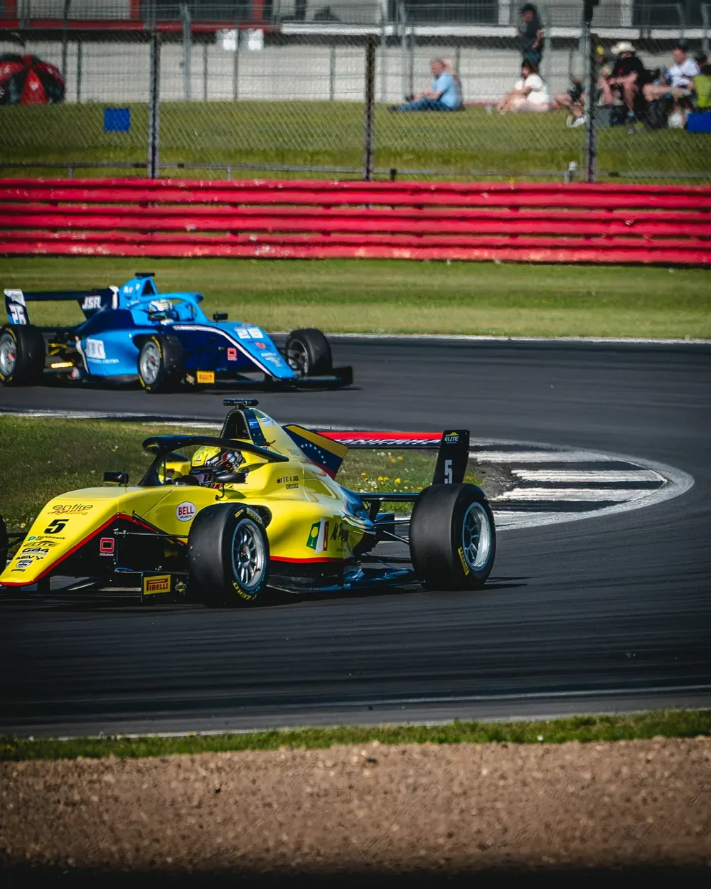
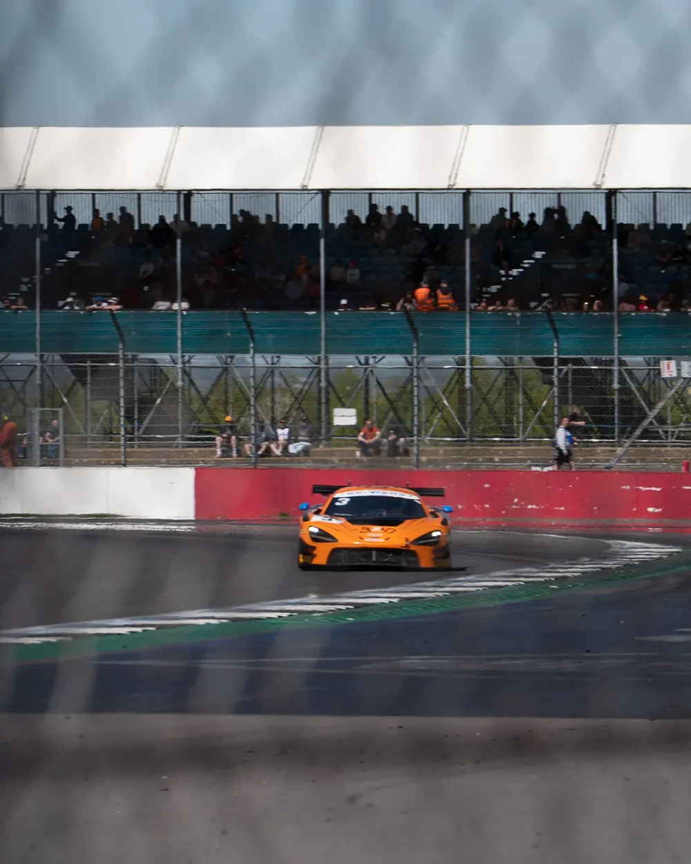
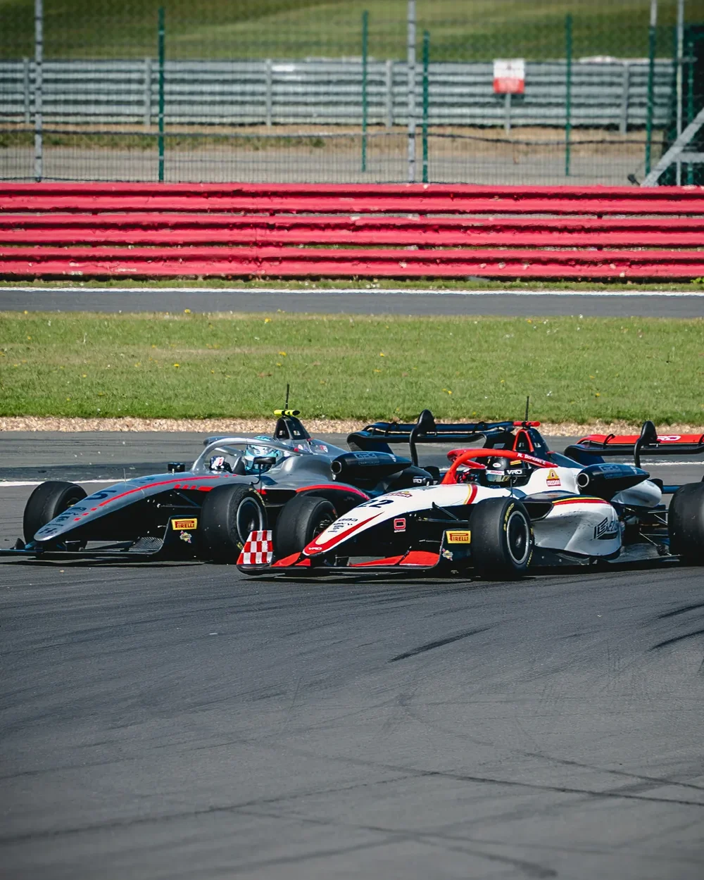
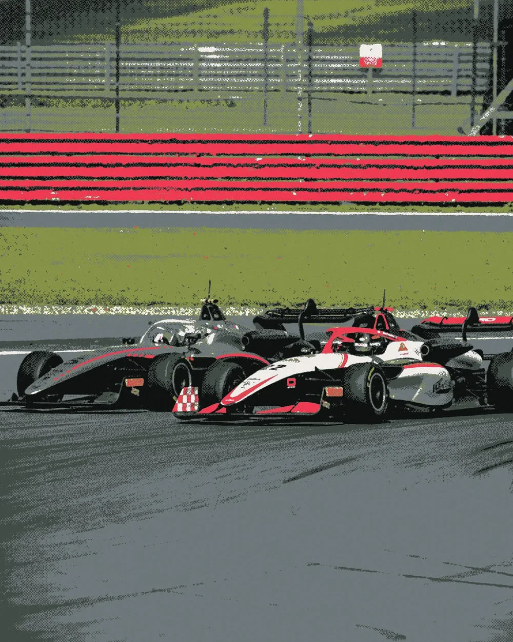
When motor racing came back after the war, Britain built a formula small enough to afford: 500cc single-seaters, most of them Coopers, many with motorcycle engines behind the driver. It became Formula 3, and a generation of drivers, Stirling Moss among them, learned their craft in it. Those races were sold on posters printed with a handful of flat inks, where colour and shape carried the noise of the day.
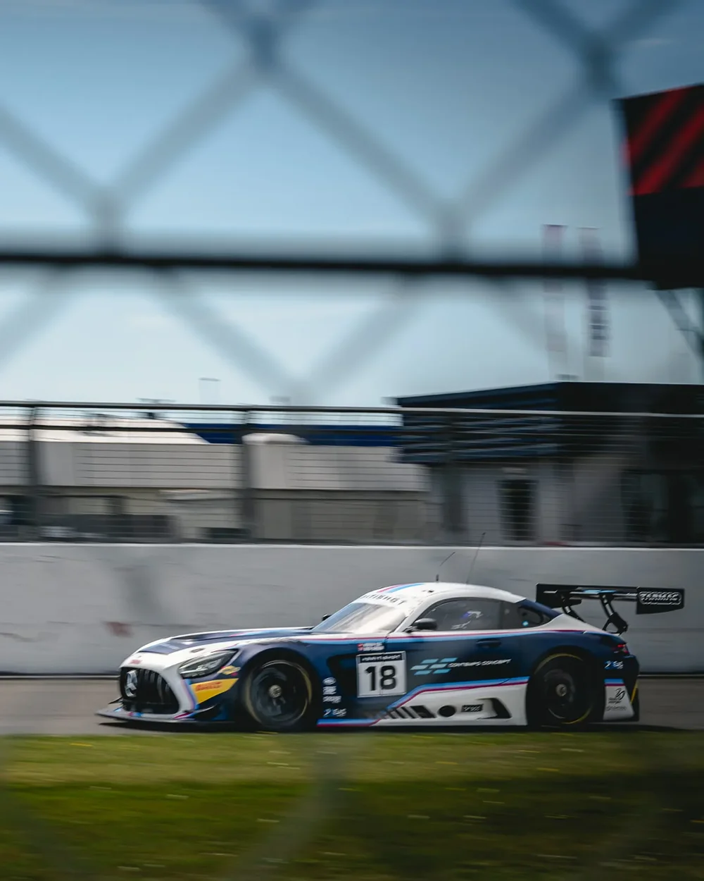
Each poster here takes its inks from its own photograph, the barrier red, the tarmac grey, the white of the bodywork, and prints them flat with halftone where they meet. Slide across and the photograph turns into a print without changing colour.
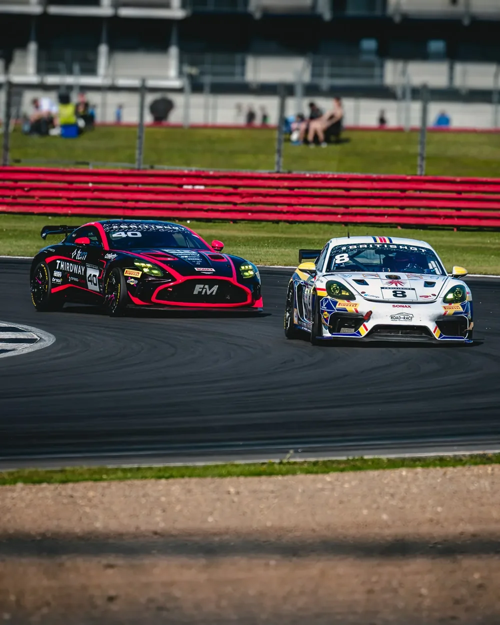
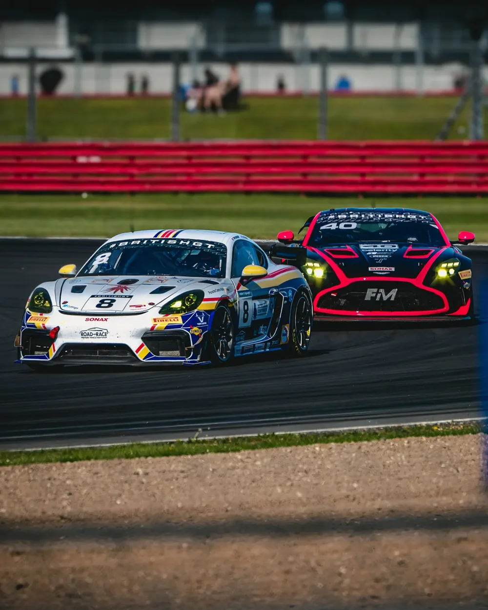
Shot from the public side of the fence at Silverstone, 2026, for myself. Treatments built frame by frame rather than with one preset, so every image has its own crop, grade and inks.
If you liked this, the Rosso Study is the same day's other half: the same circuit, pushed through smear, mono and a single red.