
Trek Bicycle
Corporation.
What happens when you stop trying to look like everyone else.
Everyone's feed looks the same.
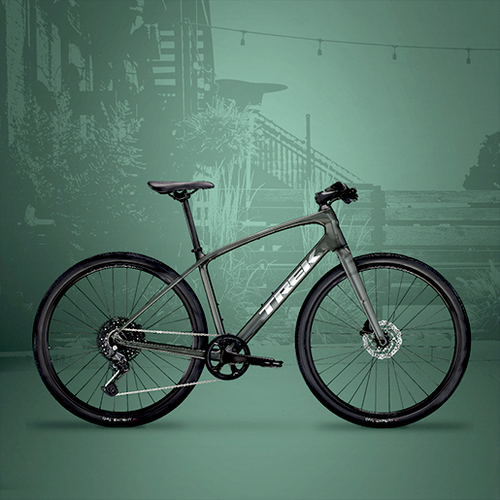
Lifestyle shot. Rider in the hills. Golden hour. Another brand telling you how free you'll feel if you buy their bike. The images are technically good. They're also invisible — because the person scrolling has already seen forty versions of them before lunch.
The brief from Trek was straightforward: improve engagement and drive down cost-per-click on Meta. The insight behind the solution was less obvious.
"Instead of competing in the lifestyle space, we went the other way. The hypothesis: if every other ad looks like a ride, ours would look like a poster. And posters stop the scroll."


Colour breaks pattern.
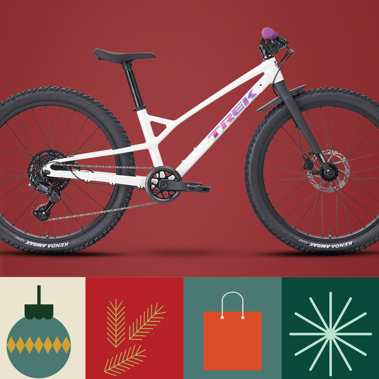
Solid Pantone backgrounds. Clean product. Type that meant something. The graphic directness you see in fashion and streetwear, not cycling. In a feed saturated with golden-hour lifestyle, a flat colour is the most disruptive thing you can put in front of someone.
We ran a seven-day A/B split test — Pantone backgrounds against lifestyle photography, same copy, same audience, same budget. The results weren't close. Colour outperformed lifestyle across every metric. Engagement up by a third. Cost-per-click down by a third.
The pattern held across Procaliber, Rail+, FX Sport and across different audience segments. It wasn't a fluke. Colour won because it was different, and different is what gets seen when everything else looks the same.
The best creative decision isn't always the expected one.
This wasn't a production budget decision. The lifestyle ads used exactly the same images, the same copy, the same audience. The only variable was the background. One creative choice — to stop looking like a cycling brand and start looking like a design brand — moved the numbers by a third in seven days.
One creative decision, tested properly, measured clearly. That's what strategic content looks like.