

Grid Line Brewing
Four beers. One city. One system.
Brand Identity · Illustration · Campaign Creative · 2026
The Brief
Milton Keynes is one of the most misunderstood cities in Britain. Dismissed as concrete and roundabouts by people who've never spent time there. But look closer and you find something remarkable, a city designed on a grid, with tree-lined boulevards, 200 miles of cycling and walking paths, and a quiet civic pride that rarely gets the attention it deserves.
Grid Line Brewing starts with that city. Four craft beers, each named after a real Milton Keynes road or landmark, each carrying its own illustration of that place. The grid road pattern wraps every can. Milton Keynes becomes the design system.
Services Brand Identity Can Design & Illustration Campaign Creative Merch Design
Year 2026
Location Milton Keynes, UK
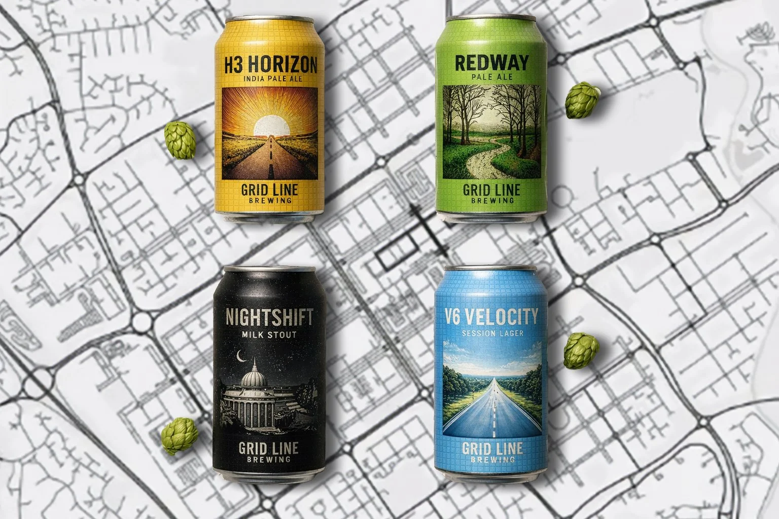
Four beers. Four Milton Keynes stories. One design system.
H3 Horizon
India Pale Ale
The H3 grid road stretching to the horizon. Morning sun rising behind it. Bold, hoppy, forward-looking.
NIGHTSHIFT
Milk Stout
The Milton Keynes civic centre under a crescent moon. Crosshatch engraving, stars scattered across the sky. Dark, smooth, considered.
REDWAY
Pale Ale
The Redway cycling paths winding through parkland. Wildflowers, bare winter trees, open sky. Fresh, approachable, rooted in place.
V6 VELOCITY
Session Lager
The V6 boulevard disappearing into a summer horizon. A lone cyclist in the distance. Clean, light, made for movement.
The System
The grid IS the brand. Milton Keynes was planned on a perfect grid , horizontal and vertical roads, each given an H or V reference number. That system became the visual language of Grid Line Brewing.
The fine grid lines wrapping each can reference the road map. The illustration style, hand-drawn engraving, references the cartographic heritage of maps themselves. Every can is a piece of the city. Every can belongs to the same system.
Campaign Creative

Brand identity only gets you so far. Grid Line Brewing also needed assets that perform in a paid social environment, stopping the scroll, communicating the brand instantly, driving awareness.
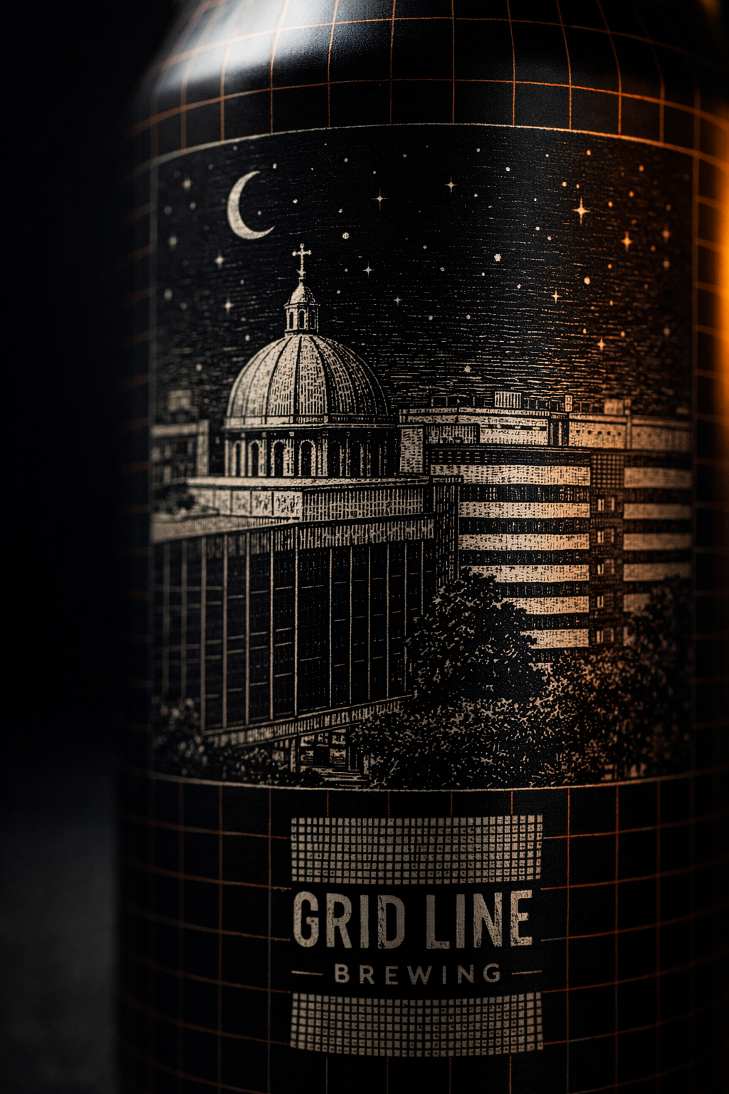
The Nightshift macro close-up became the hero ad. Extreme detail, dramatic amber lighting, the engraving illustration filling the frame. The kind of image that makes someone stop and look twice.
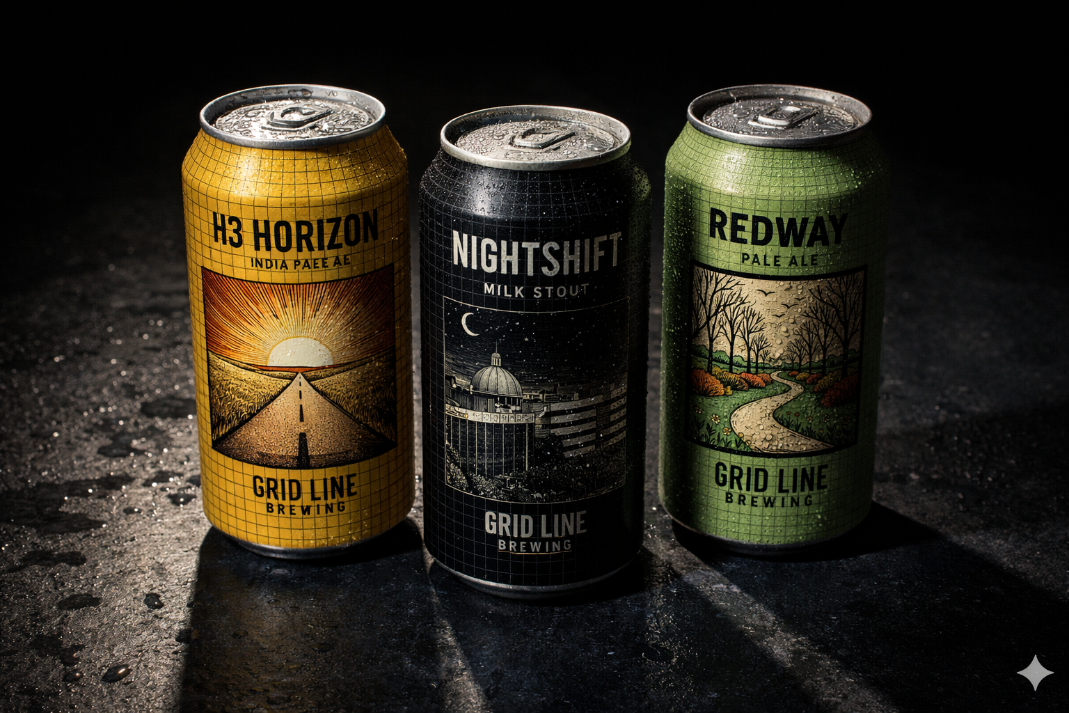
The four can flat lay delivers the complete range story in a single frame. Premium, cinematic, unmistakably craft.
What This Demonstrates
Grid Line Brewing shows what Fairford Studios does at its best, building a complete brand world from a single idea. Not just a logo or a label, but a system. A language. A story that lives across every touchpoint.
If you're building a brand that needs to mean something, in food and drink, lifestyle, retail or beyond — this is the kind of thinking I bring.